ARE YOU READY TO MAKE SOMETHING AMAZING TOGETHER?
Transform your brand today! Drop me a message and let’s have a chat.
LDN LIQ is a UK-based e-liquid brand that offers exceptional e-liquids at an affordable price. Known for its unique and popular flavours, LDN LIQ initially launched in the UK and EU and has gradually expanded its reach worldwide, establishing a strong global presence.
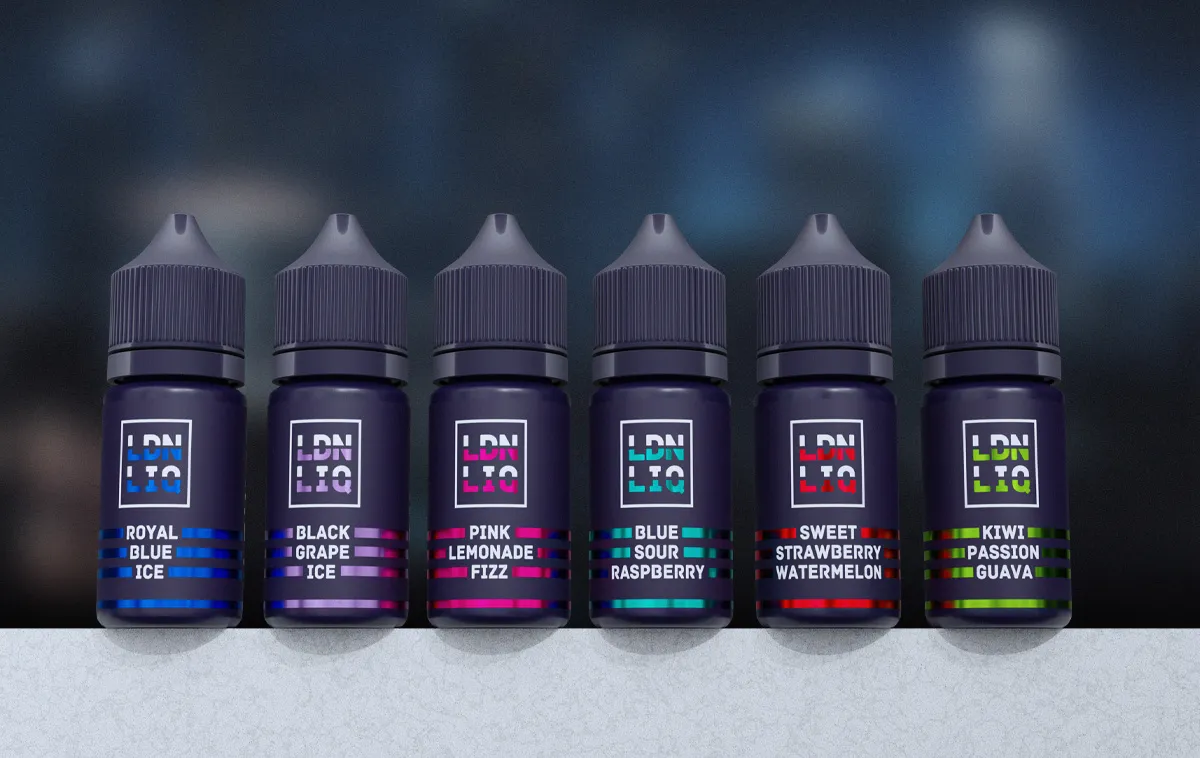
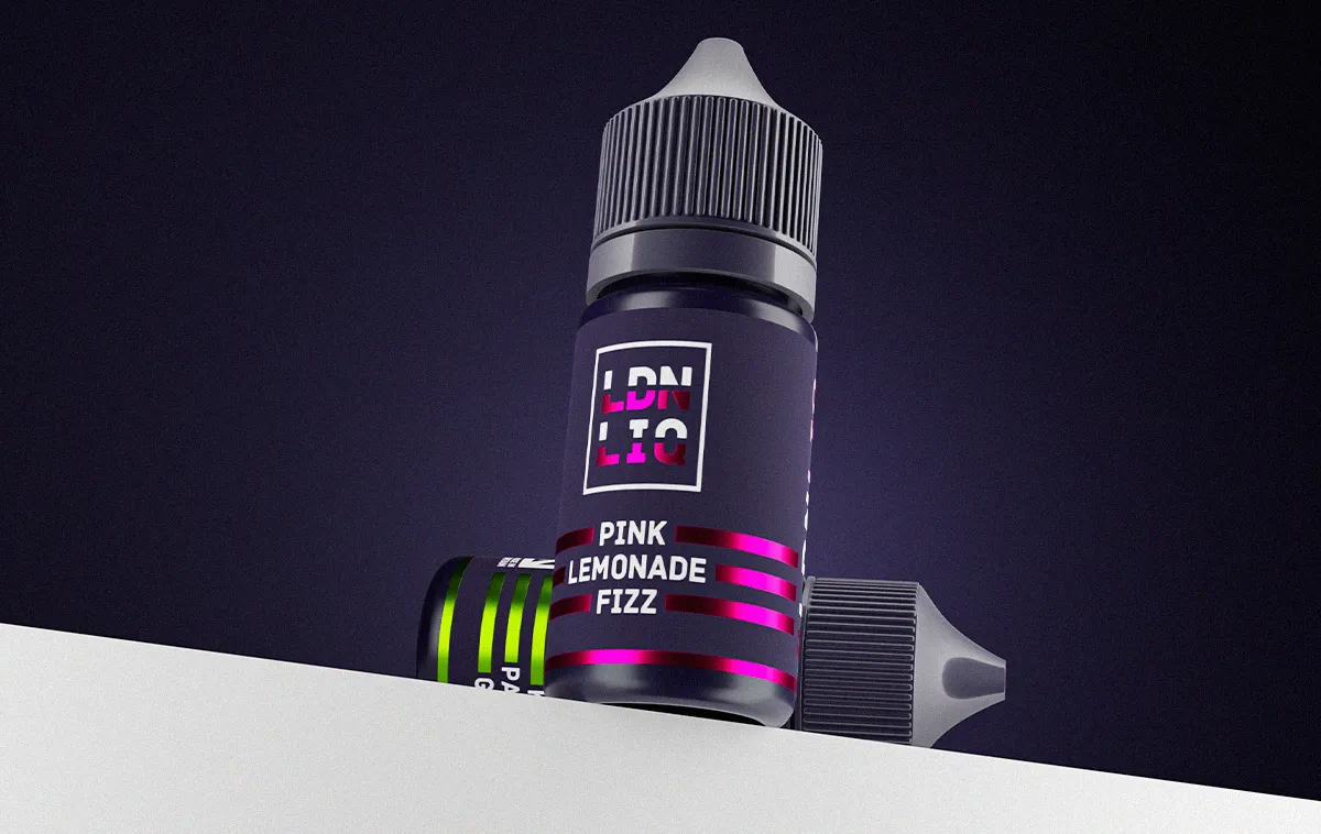
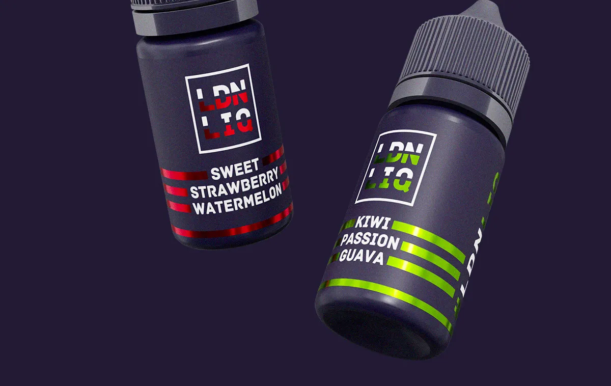
Transform your brand today! Drop me a message and let’s have a chat.
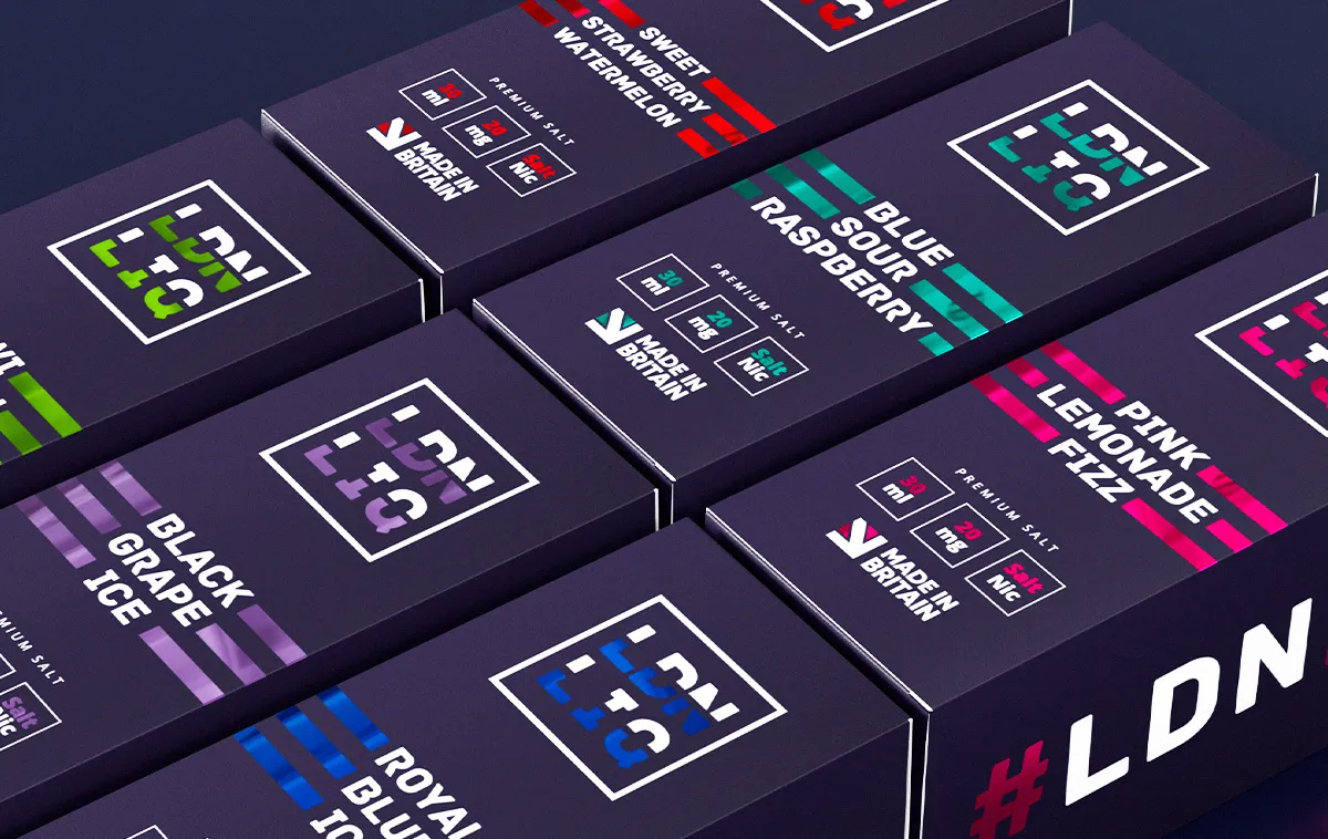
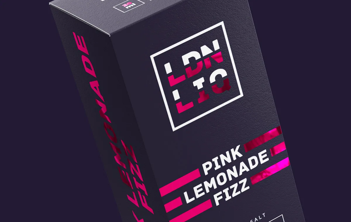
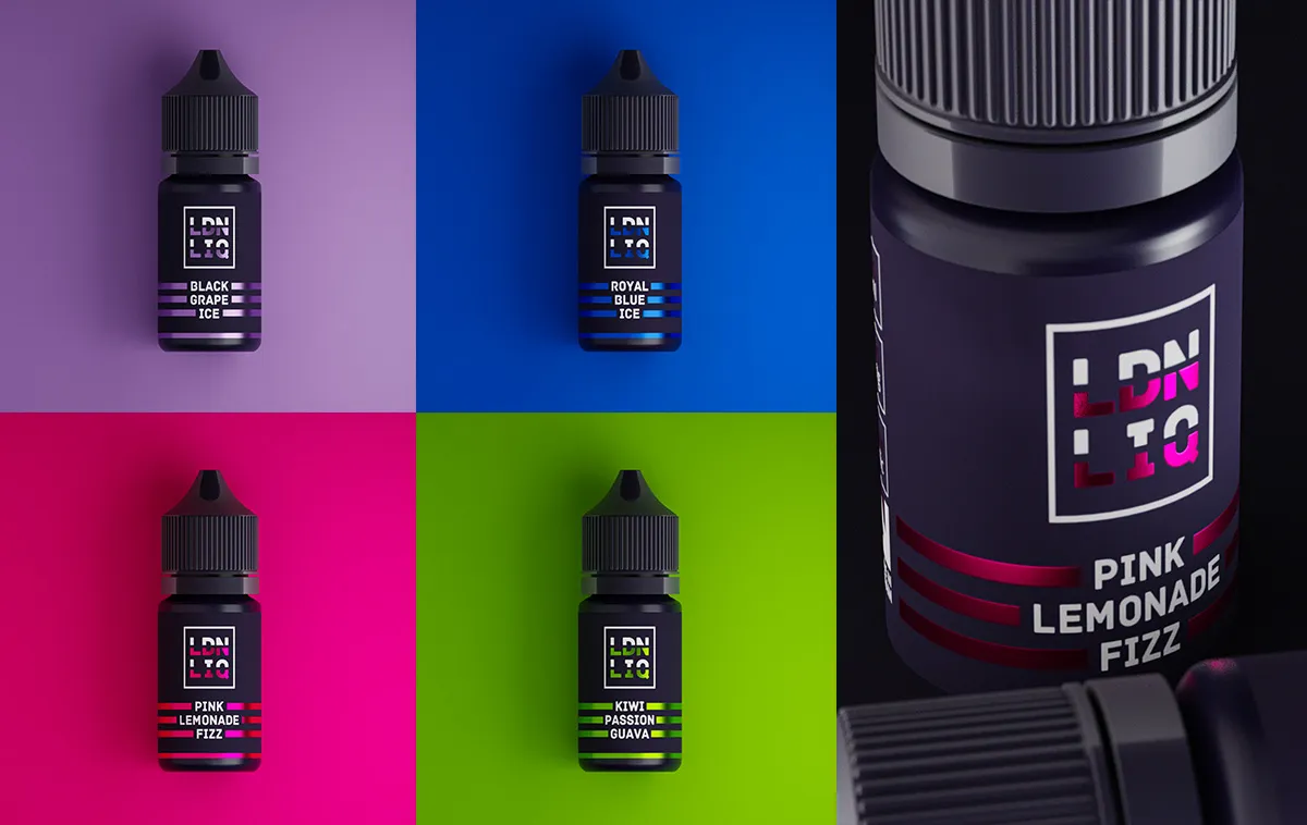
LDN LIQ approached me to design their entire e-liquid range, with a focus on capturing the diverse flavours of London. Each colour and flavour represents a different borough of the city. To create a distinctive look, we opted for navy blue bottles and incorporated foil accents on the labels and boxes to evoke a luxurious, premium feel that reflects London’s essence. I worked on both 10ml salts and 30ml shortfills to develop this exceptional product line.
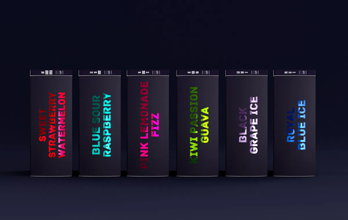
Color Palette: We utilised vibrant colours with a foil finish to clearly differentiate each flavour, making it easy for customers to identify their preferences. The navy blue background was carefully analysed for optimal contrast with the chosen colours.
Typography: The typography was selected to be modern and approachable, ensuring clarity while adding a unique character that aligns with the brand’s personality.
Imagery: Our goal was to convey a lively and colourful atmosphere that highlights the flavour experience. We incorporated dark backgrounds with vibrant lighting to reflect the city’s vibrant nightlife and party scene.
Packaging Design Process: We began with the design of the 30ml shortfill e-liquids before adapting the aesthetics for the 10ml salts. A key challenge was achieving the ideal foil finish for the colours. After considering options between foil and spot UV, we ultimately decided that the foil finish would provide the best effect.