Branding and Packaging Process for Doula with Yoga
I had the pleasure of working with Federica on an incredibly meaningful and exciting project—helping her create a brand for her new venture as a doula who incorporates yoga for pregnant women. Federica’s services focus on guiding expectant mothers through pregnancy with mindfulness, yoga, and support, so it was a project I was really passionate about from the start.
ARE YOU READY TO
MAKE SOMETHING
AMAZING TOGETHER?
Transform your brand today! Drop me a message and let’s have a chat.
Federica came to me with a vision, and together, we started building her brand from the ground up. She had such a clear sense of what she wanted to offer, and it was about finding a way to visually represent that calming, nurturing energy that is so central to her work. We wanted the brand to feel warm, grounded, and connected to nature—something that would resonate with her clients from the moment they saw it.
Design Goals and Brand Identity:
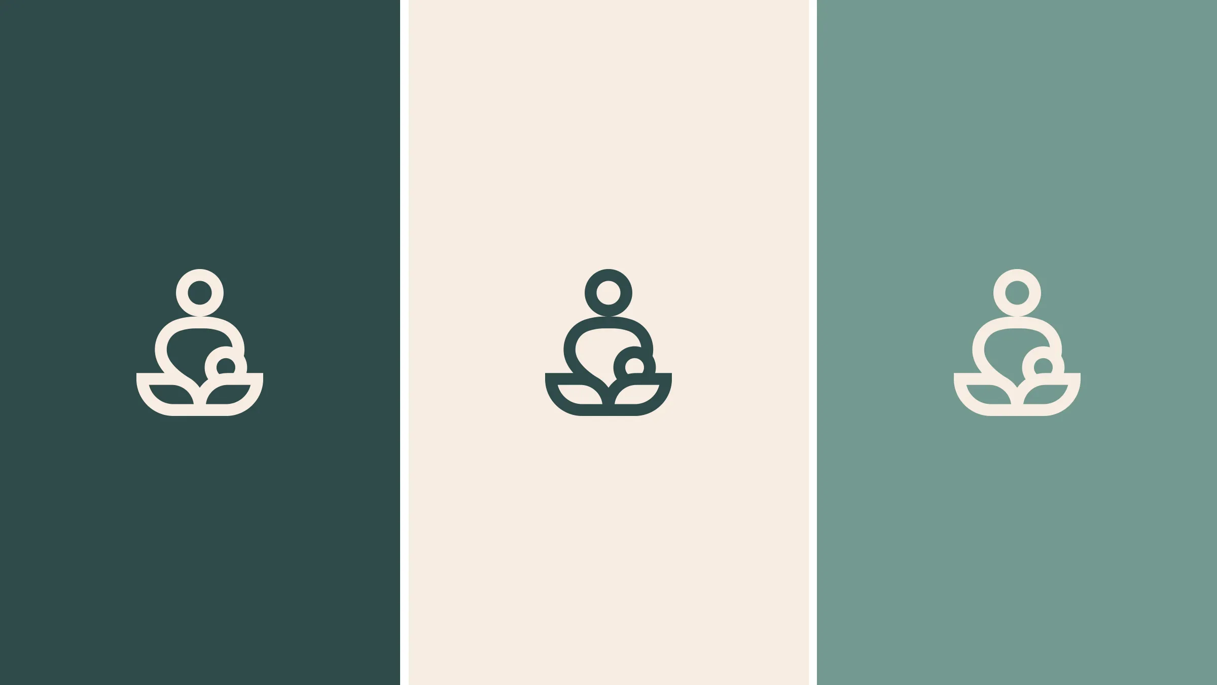
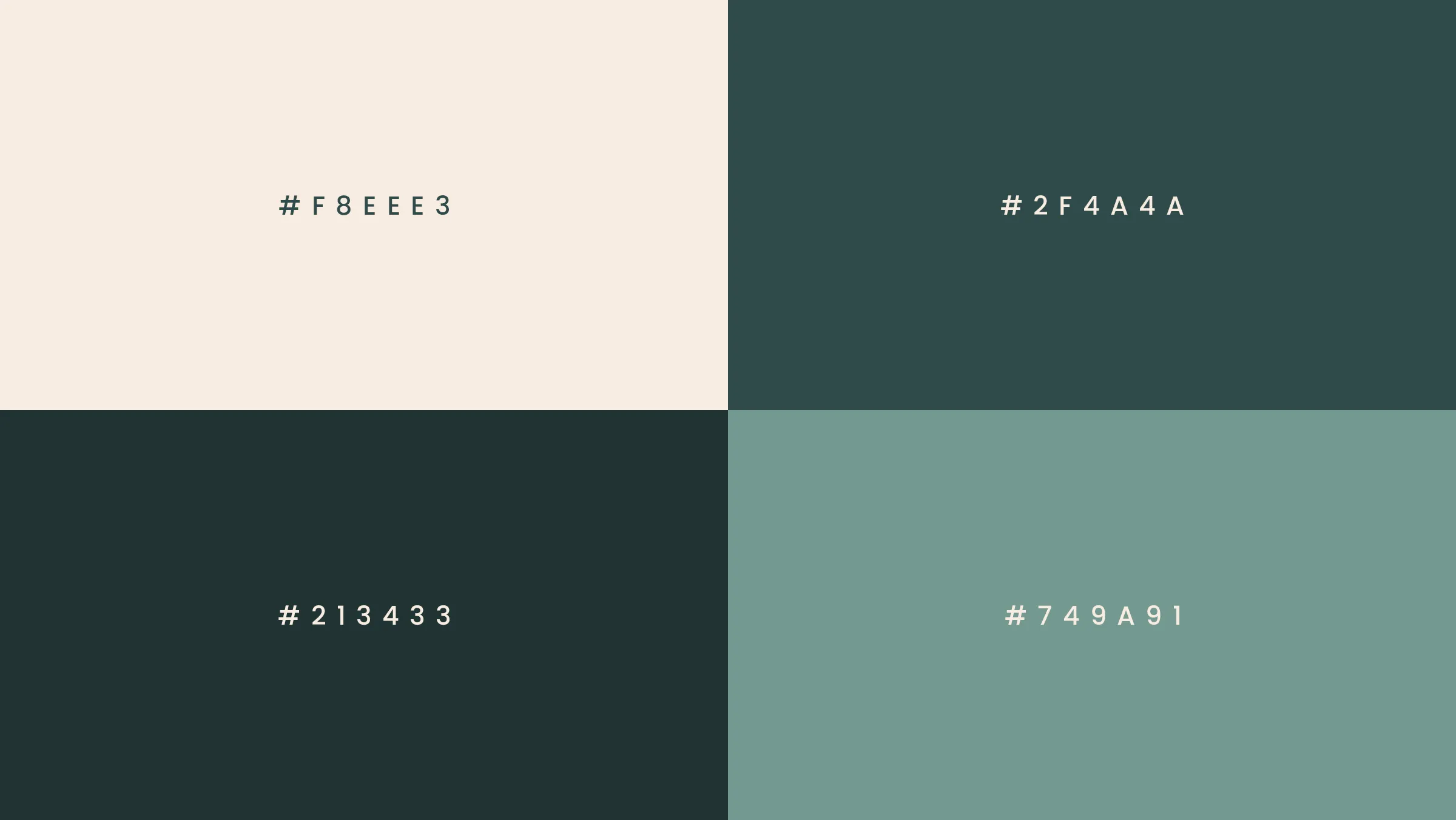
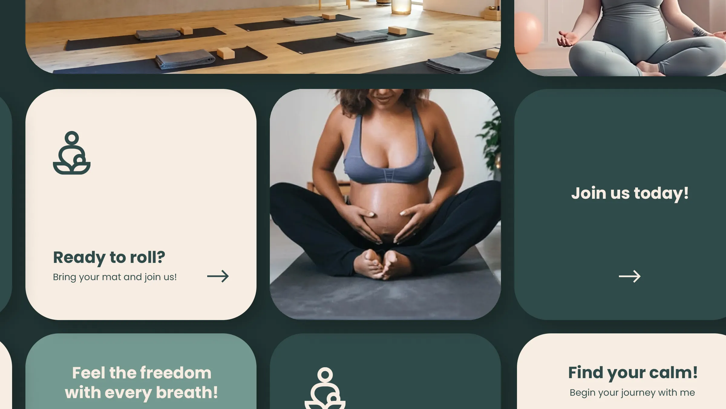
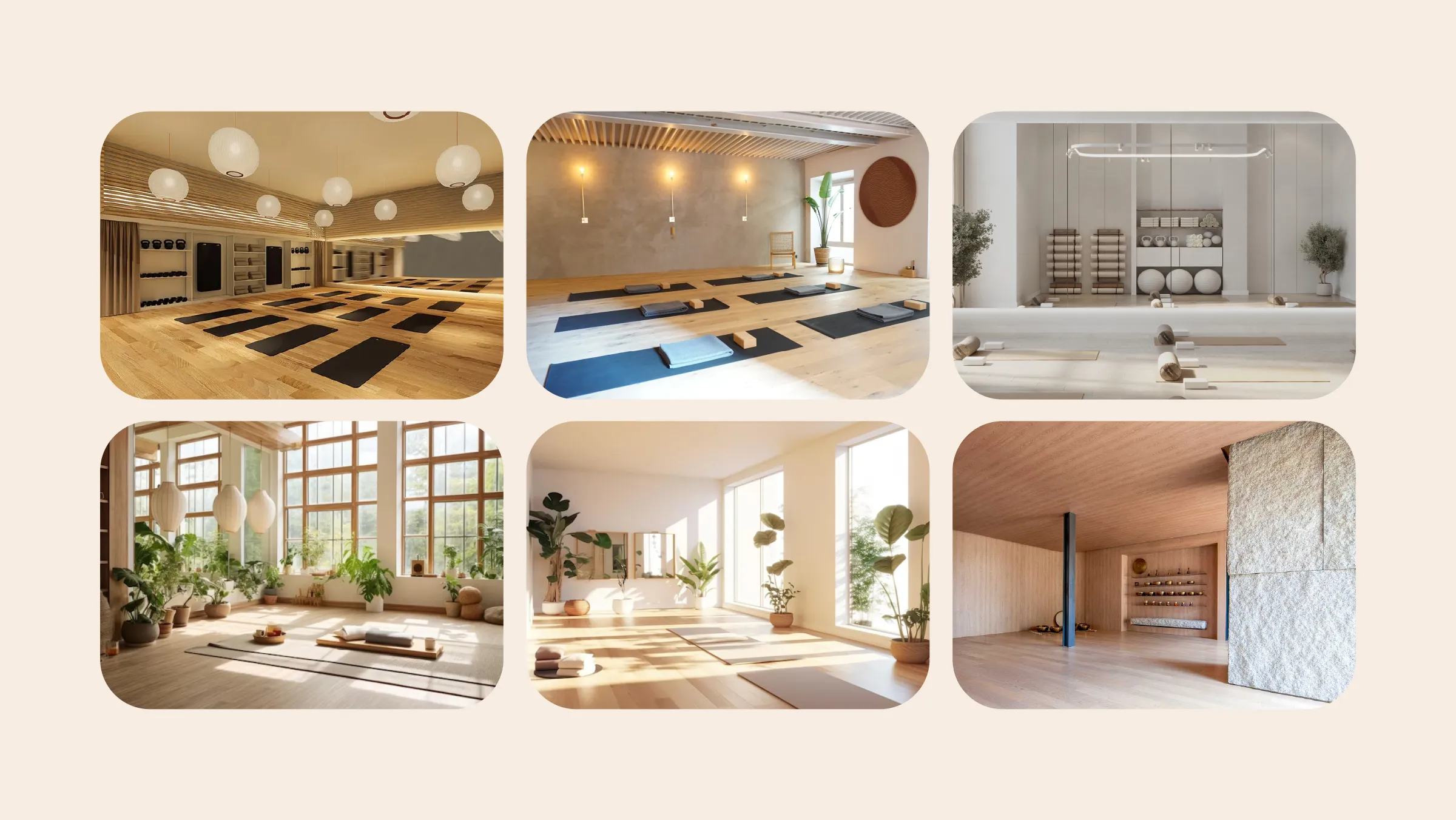
Given that her services are focused on pregnancy, mindfulness, and yoga, I chose to work with an earthy colour palette. We wanted the overall feeling to be one of relaxation, calm, and connection to nature. Using soft greens, pastel tones, and warm earth colours, we created a soothing atmosphere that speaks to the essence of both yoga and motherhood. The colour combination feels fresh and calming, making it the perfect fit for a space that promotes wellbeing.
Key Design Elements:
Color Palette: Earthy tones were key to giving the brand that sense of calm and groundedness. We used a variety of soft greens and pastel colours to evoke a sense of peace and tranquility. The combination looks gentle and welcoming, just like Federica’s services.
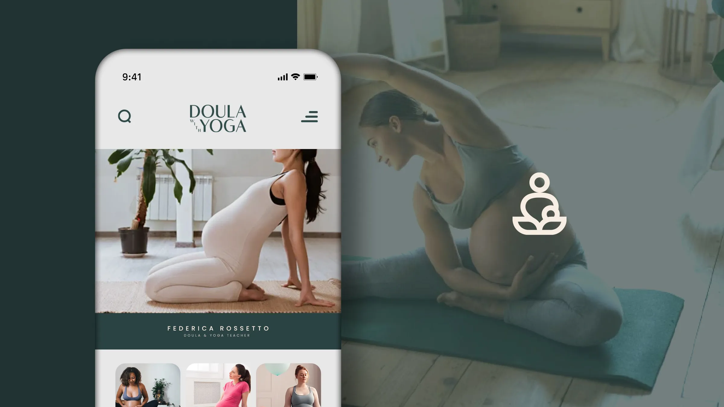
Typography: I opted for a rounded sans-serif font—modern, but still approachable and soft. It’s clean and legible, but also friendly, which works well with the calming nature of the overall design.
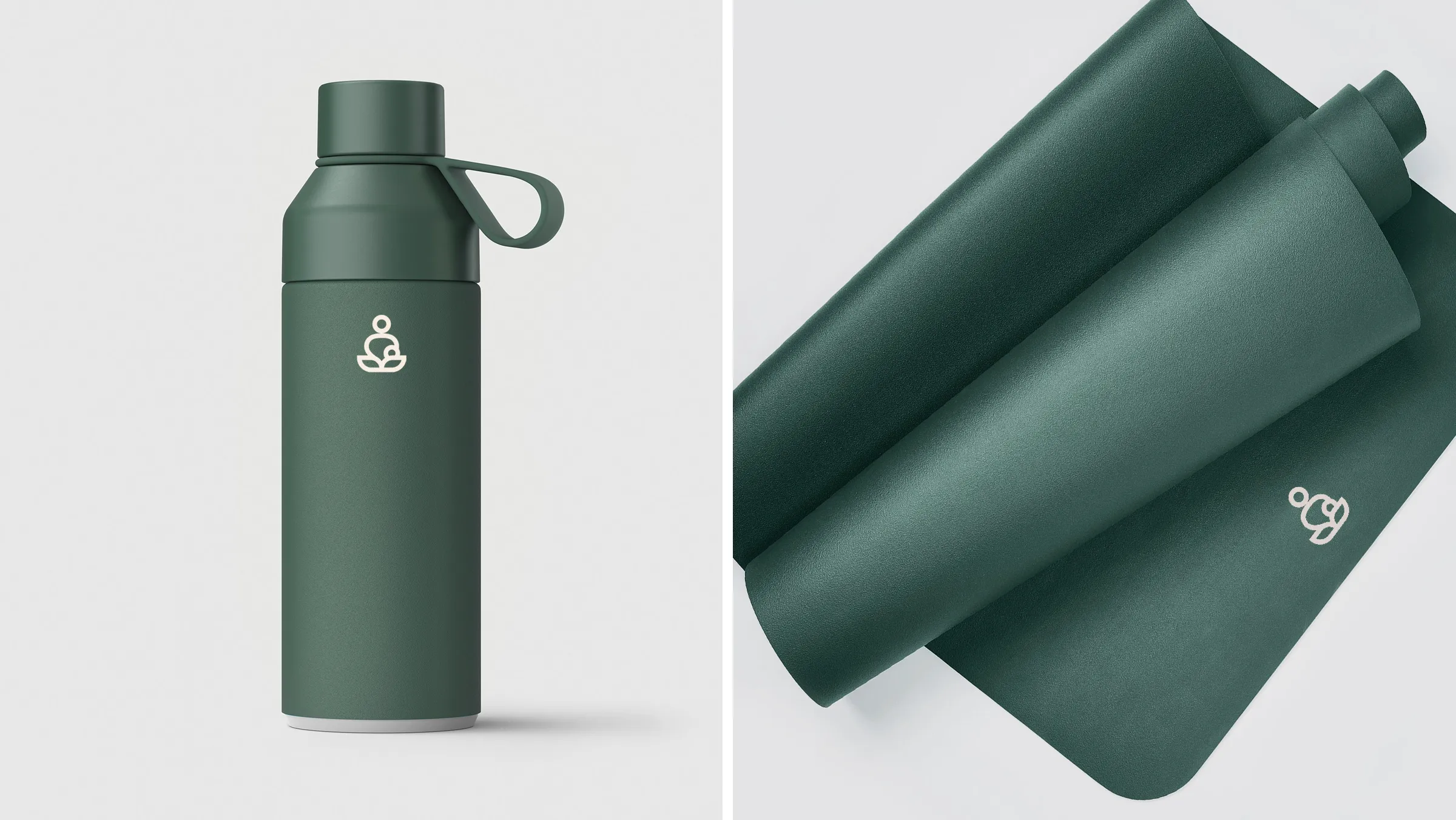
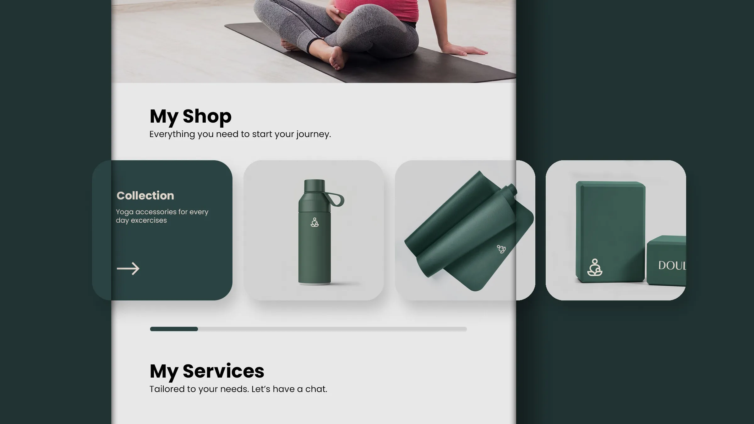
Imagery: When it came to imagery, we focused on textures that felt both modern and serene—things like concrete, wood, and marble. These textures help convey a feeling of groundedness and natural beauty, which ties back to the themes of yoga and mindfulness.
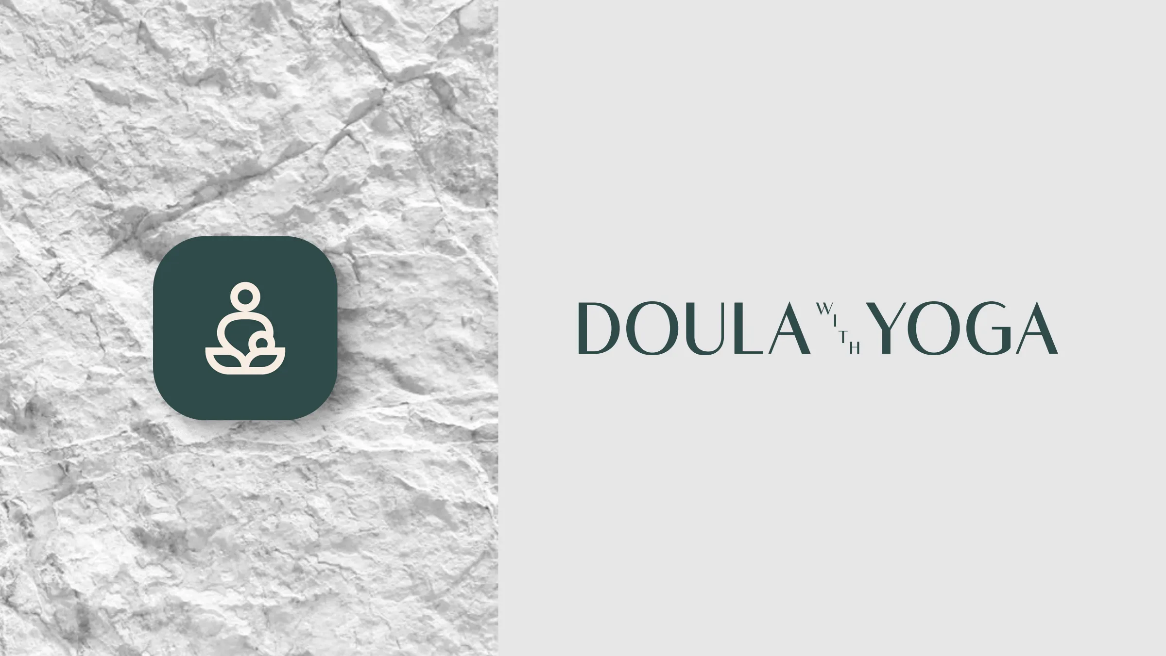
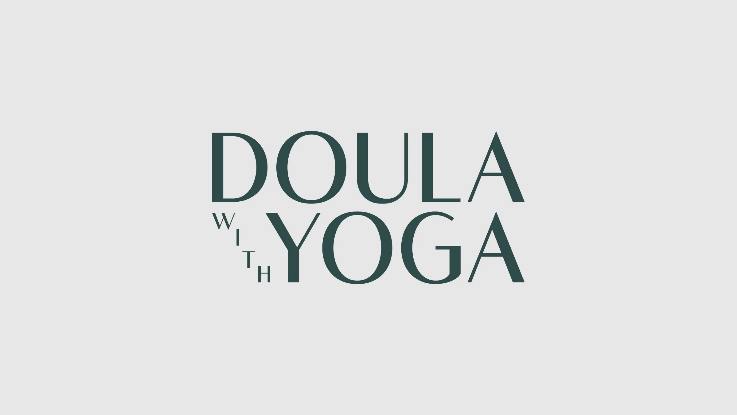
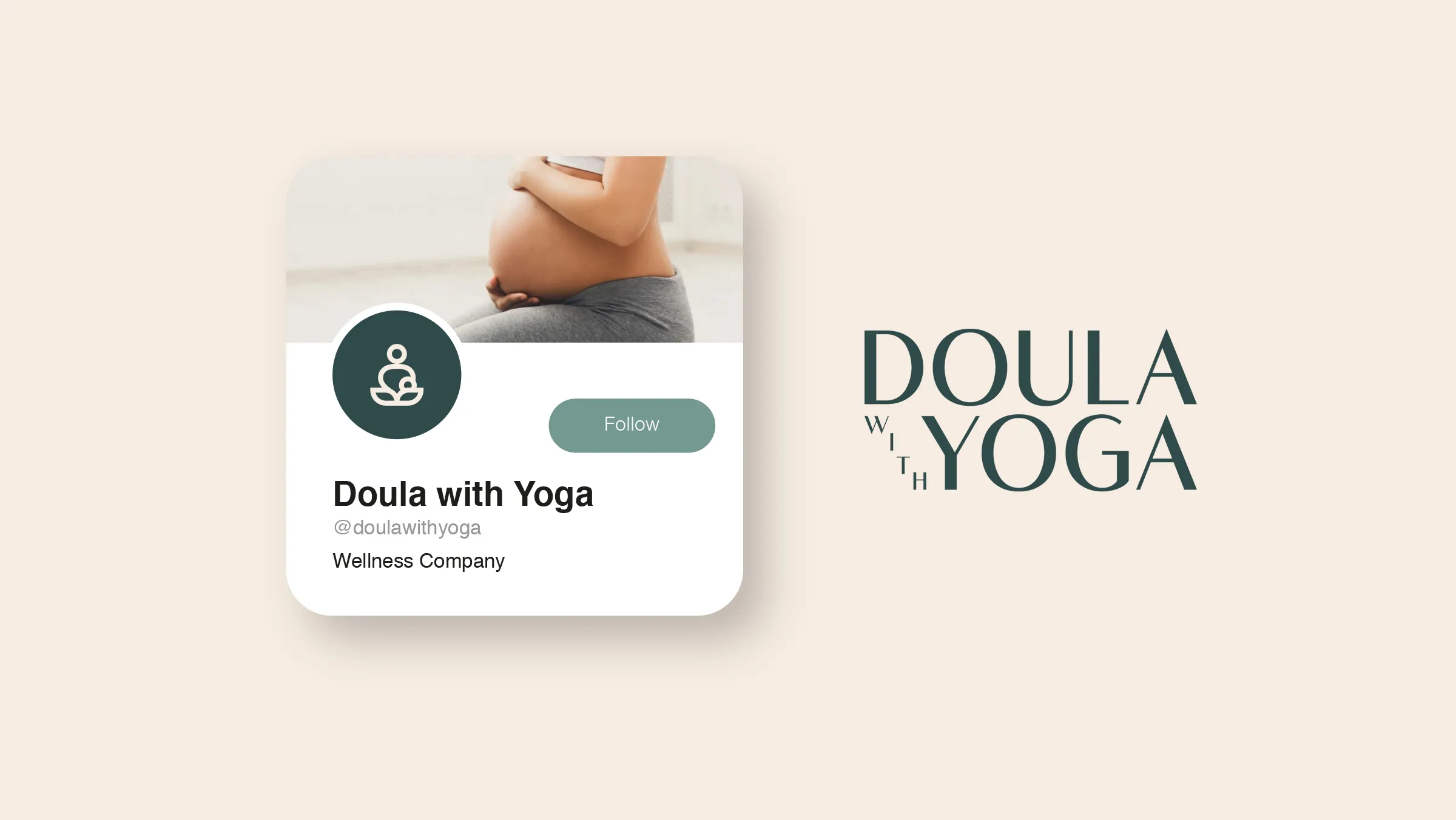
Creating the Logo
For the logo, we decided to go with both an insignia and a wordmark. The insignia can be used on products and smaller applications, while the wordmark ensures flexibility across her website, social media, and promotional materials. It’s a timeless design that gives Federica the versatility she needs, while still feeling personal and reflective of her journey.
The Result
Working on this project was a true pleasure. It was so rewarding to create a brand that feels as peaceful, nurturing, and natural as the services Federica is offering. From designing yoga accessories to crafting leaflets, every part of this brand reflects the heart and soul of Federica’s work with pregnant women.
I’m really excited for her to share this brand with the world, and I hope it helps her connect with even more expecting mothers looking for support on their journey.