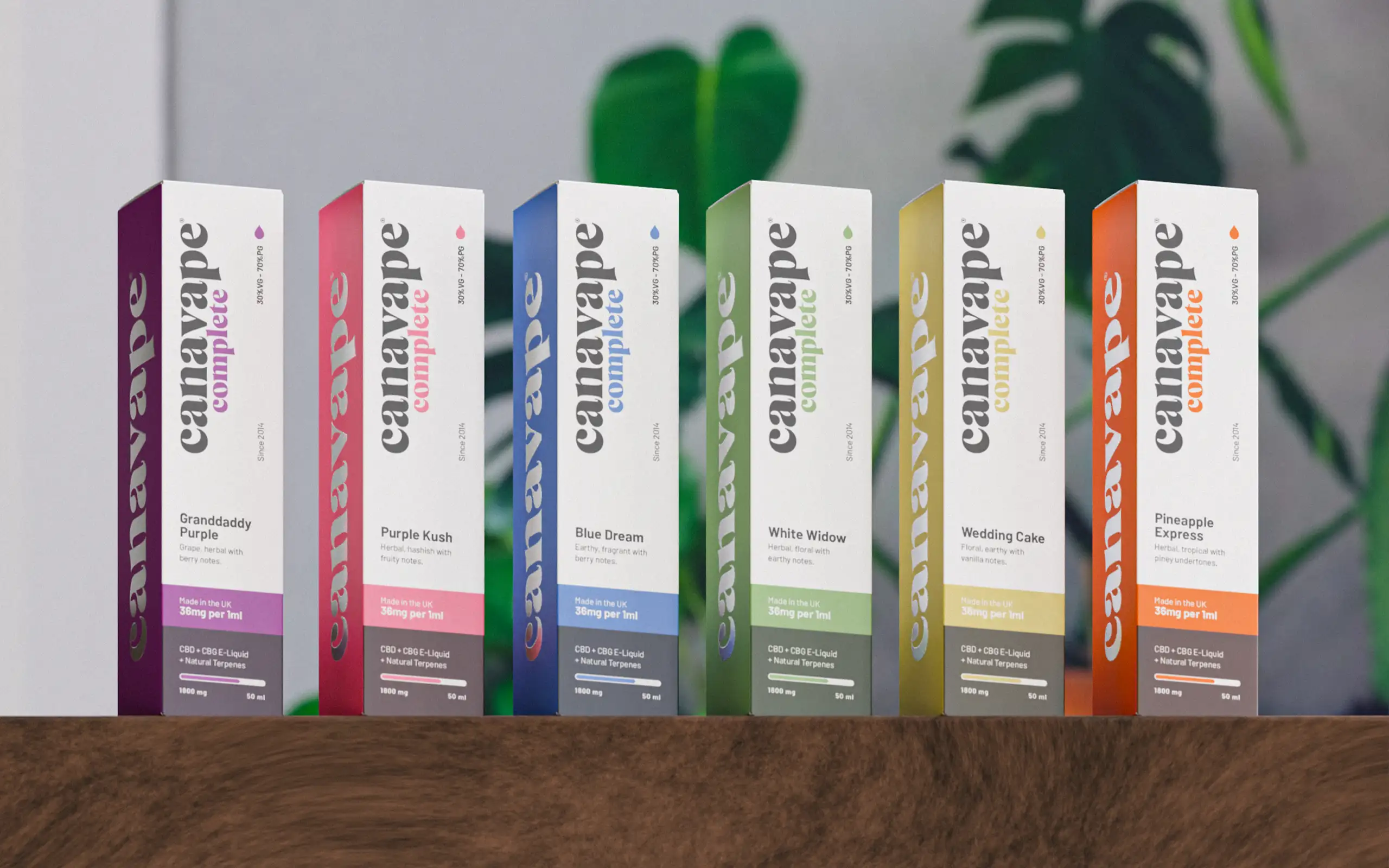
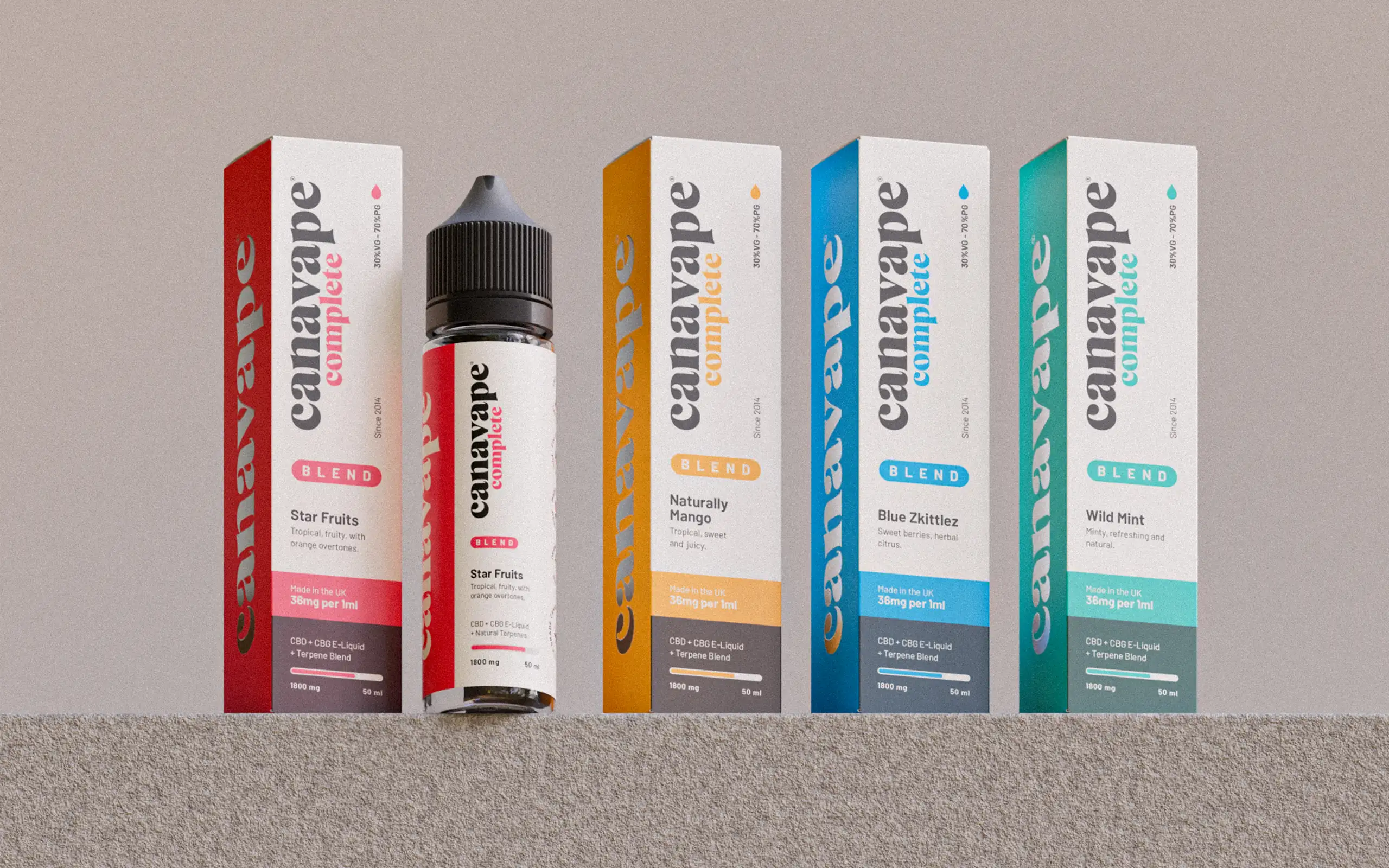
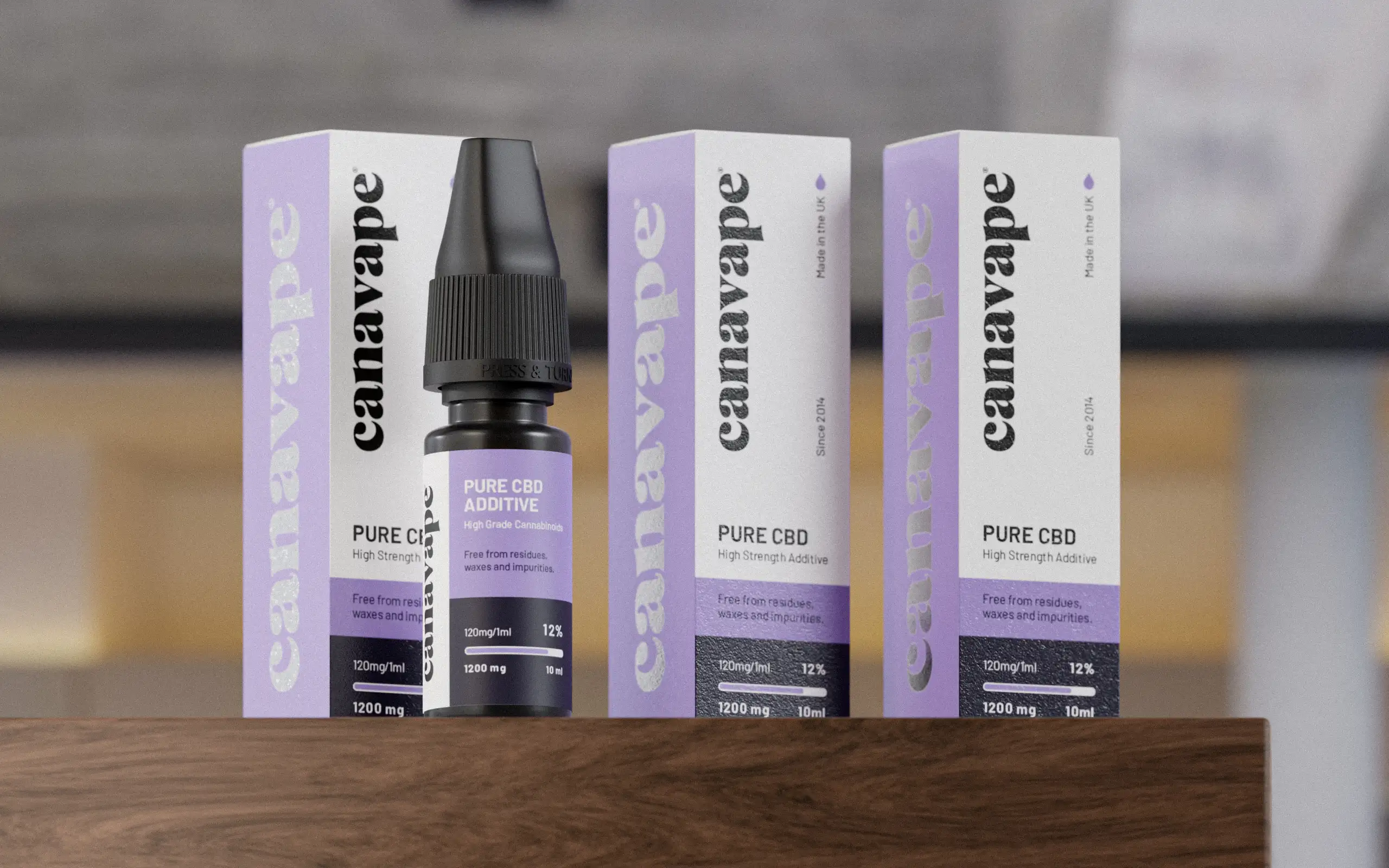
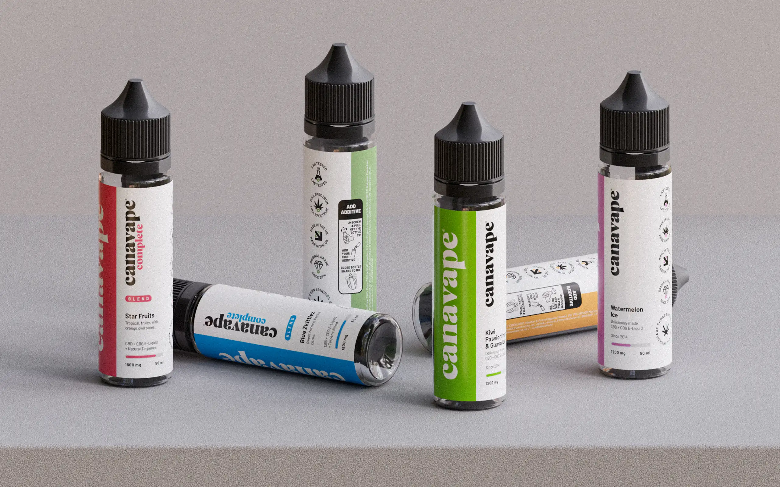
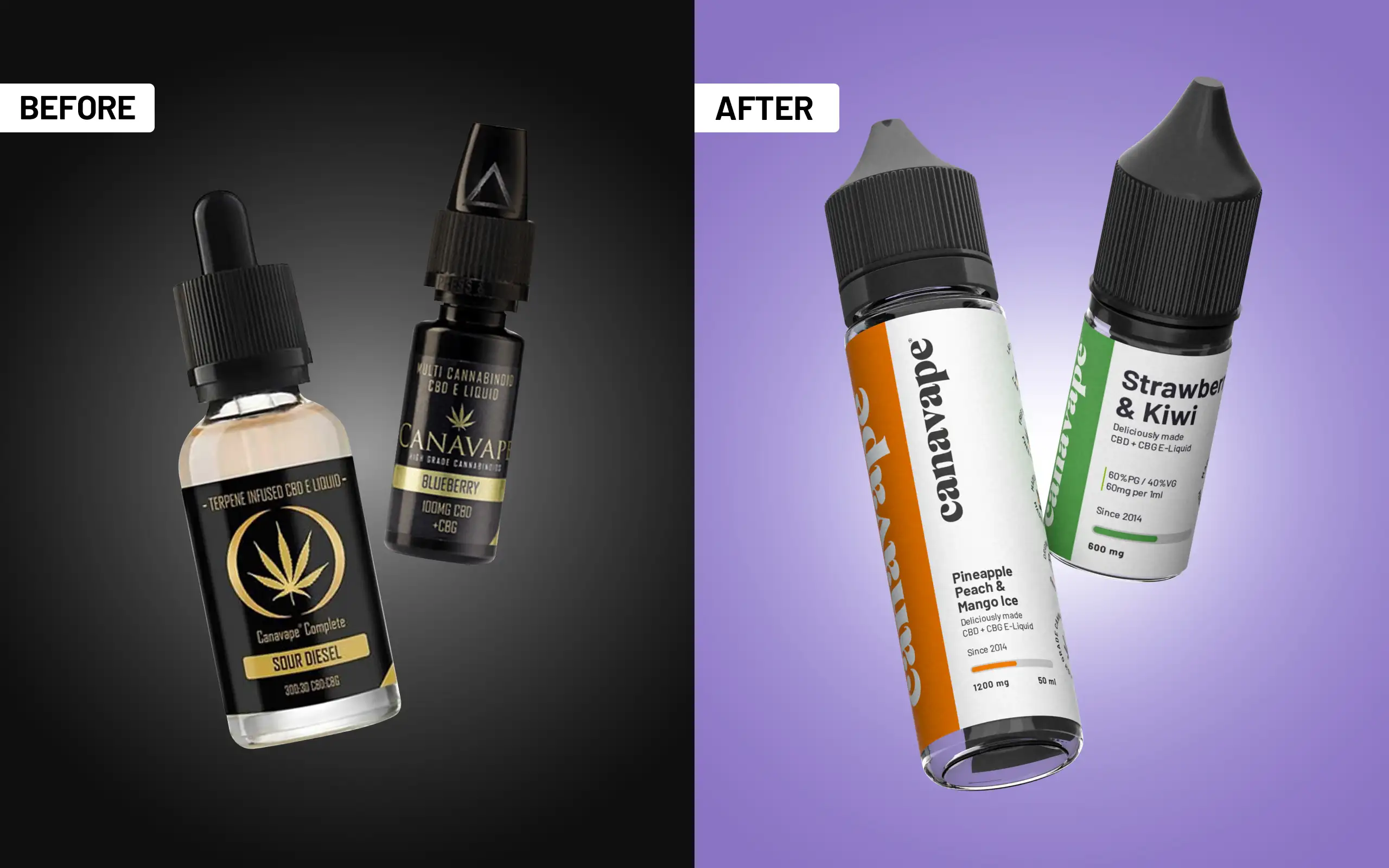
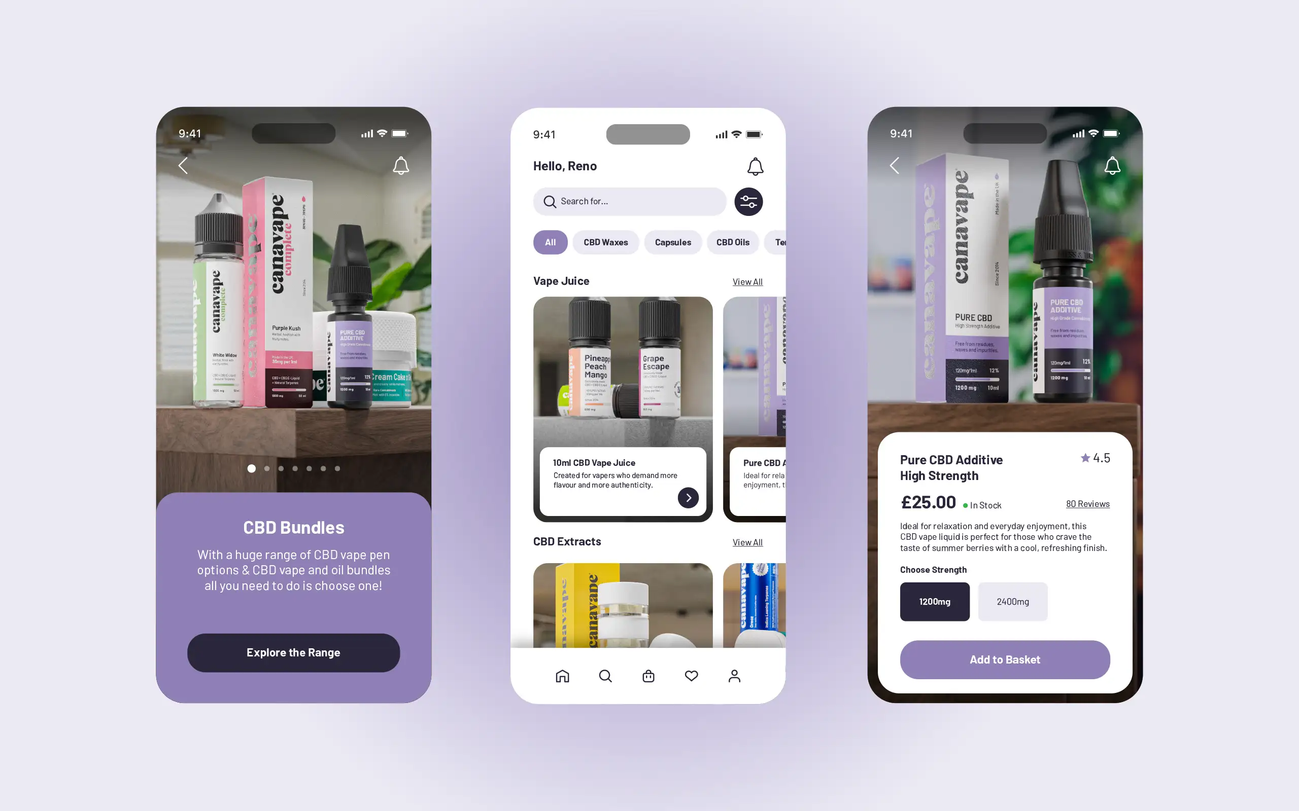
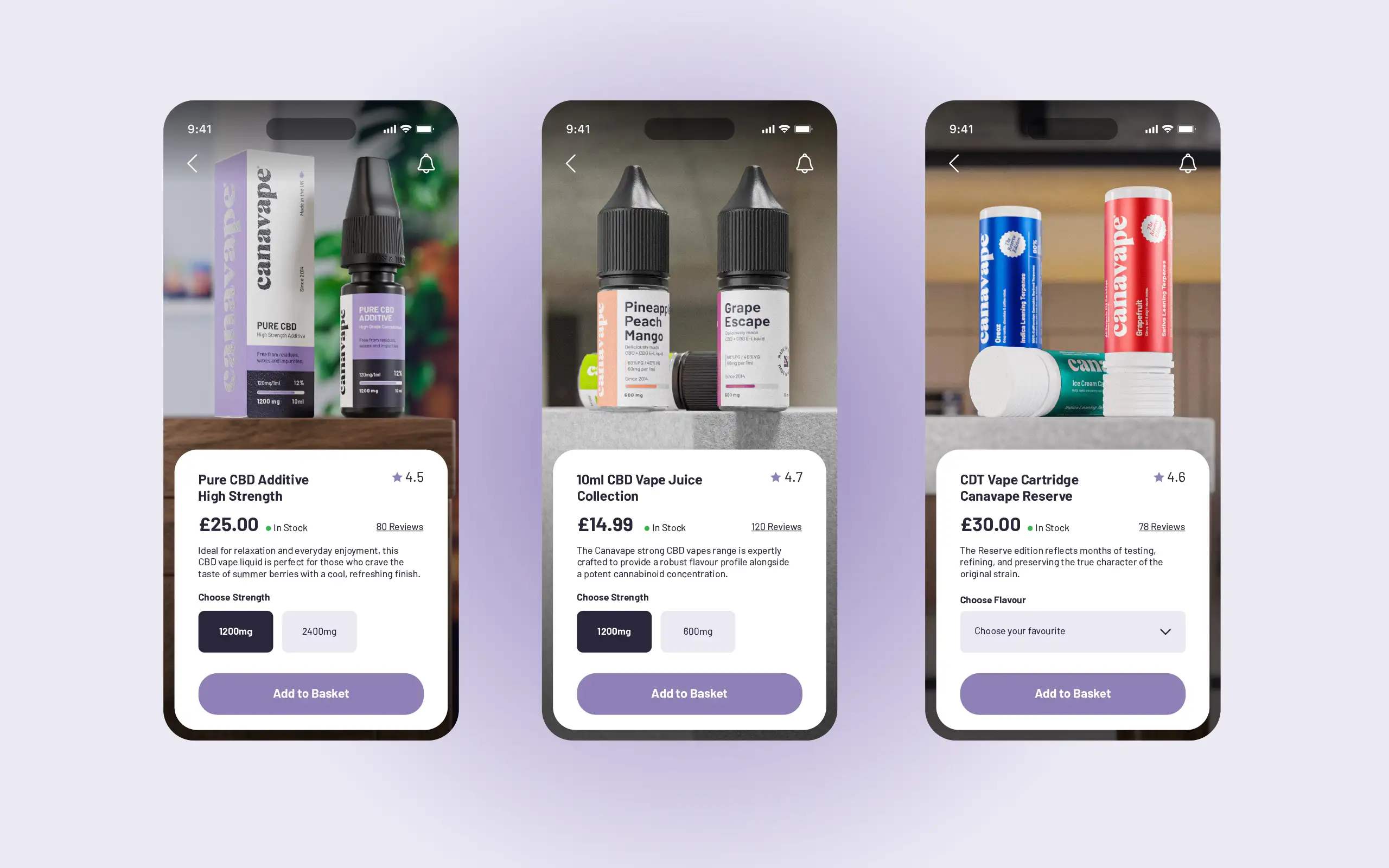
As some legacy products were being discontinued, this created an opportunity to focus on a new generation of offerings. I began by developing a mood board centred around a minimalist yet vibrant aesthetic. The goal was to highlight the boldness of the flavours while maintaining a clean, wellness-oriented look—avoiding anything overly loud or gimmicky.
We introduced a system of bold colours set against white backgrounds, paired with a strong, prominent logo across all packaging and labels. A key detail was the use of metallic foil for the Canavape logo, adding a subtle sense of exclusivity and premium quality.
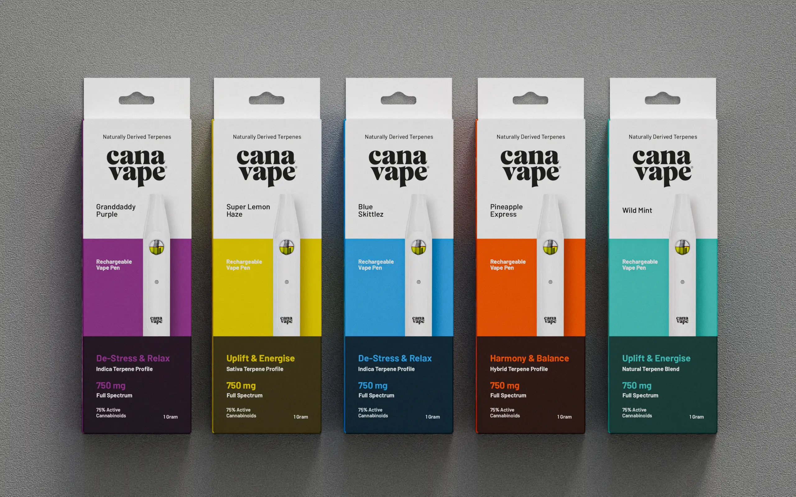
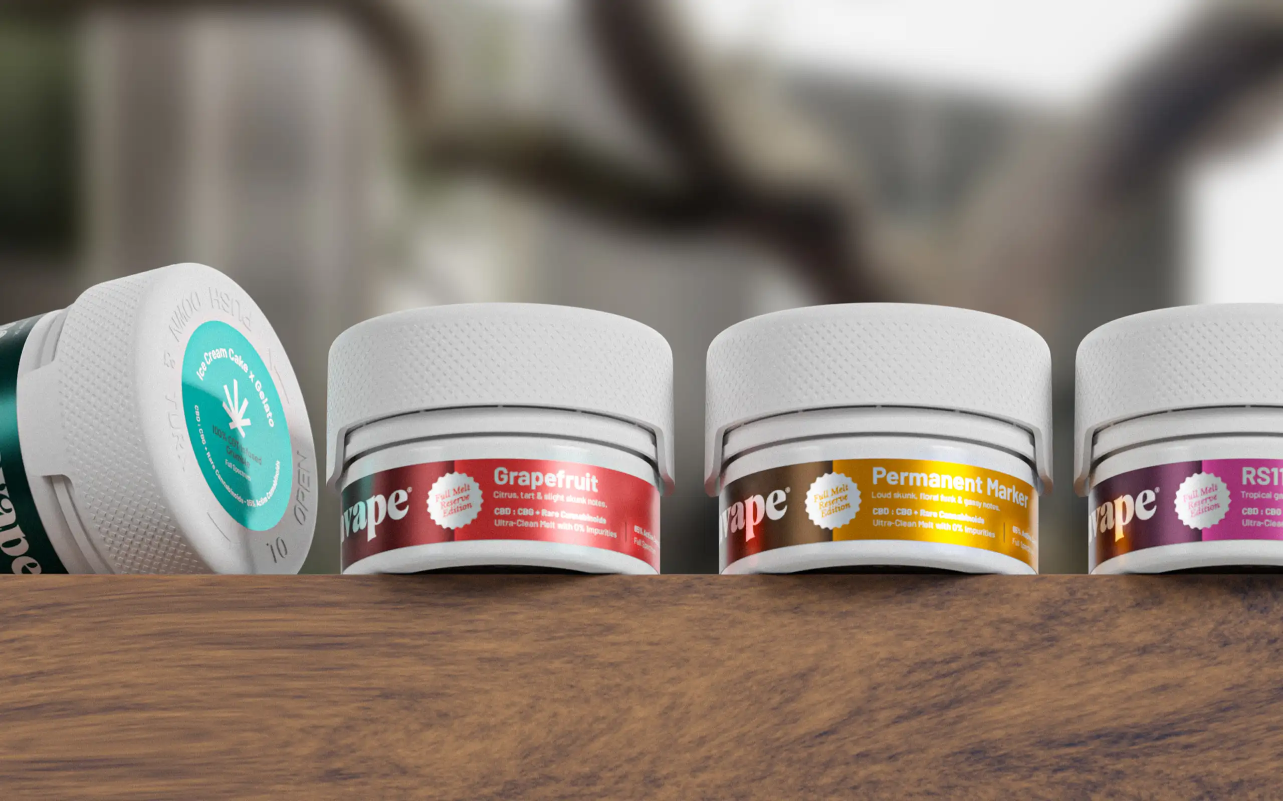
The rollout began with vape products and expanded across the wider range, including waxes, additives, cartridges, as well as balms and topicals.
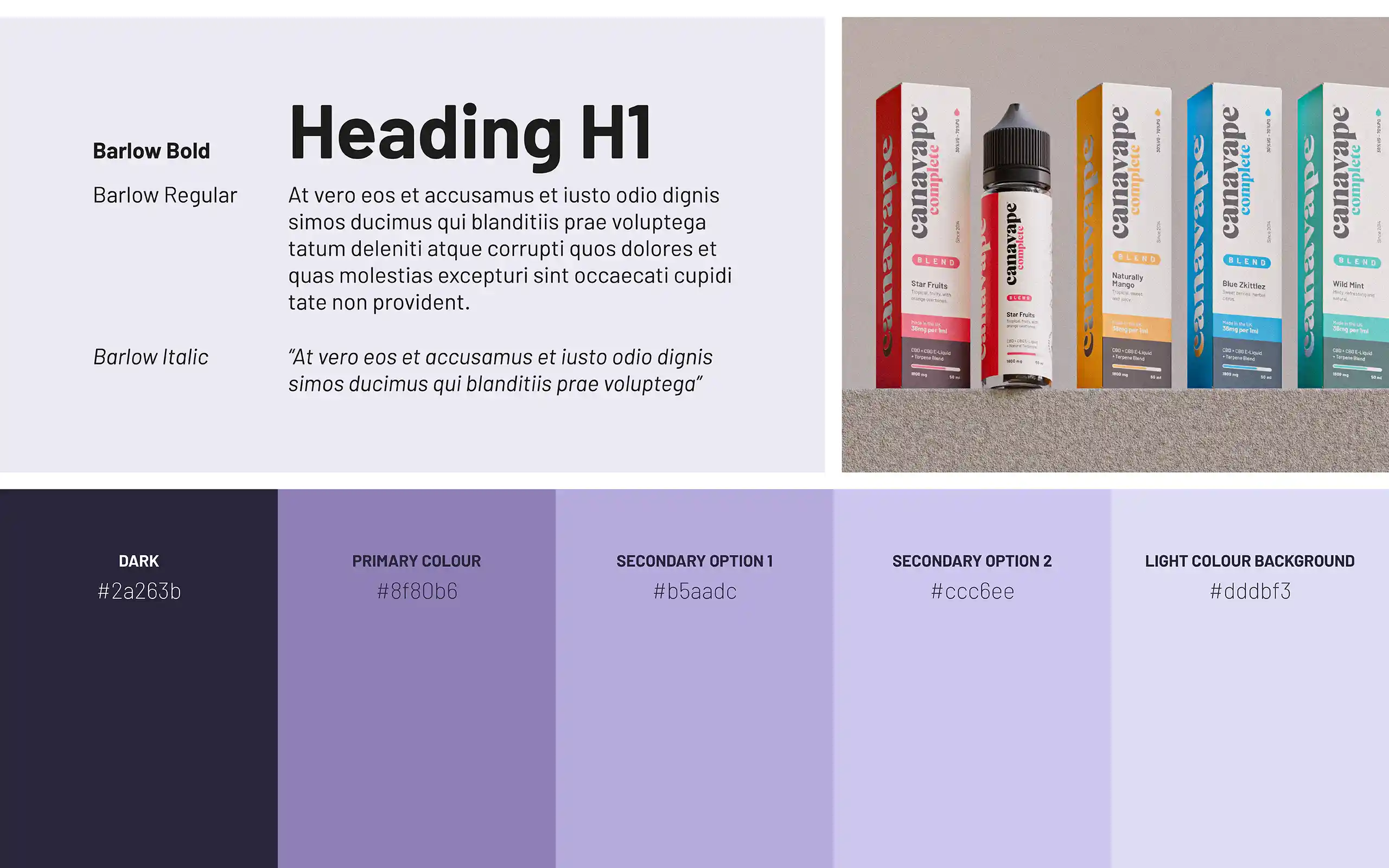
Branding & Typography
Typography was aligned with the new typeface being introduced on the upcoming website, ensuring consistency across both digital and physical touchpoints. The Canavape logo was given prominence throughout, reinforcing brand recognition while supporting a polished, high-quality aesthetic.
The Final Look
The final identity strikes a balance between vibrancy and credibility—capturing the energy of the flavours while maintaining the seriousness expected from a CBD wellness brand. Clean, light backgrounds combined with dynamic lighting help the colours stand out, resulting in a design system that feels fresh, engaging, and confident.
Why I’m Excited About This Launch
I’m incredibly proud of how this project came together. It was a pleasure collaborating with the team, and I’d love the opportunity to continue working together on future product lines. Seeing the final packaging and overall design system come to life has been especially rewarding, and I’m excited to see the full rebrand implemented across all brand touchpoints.