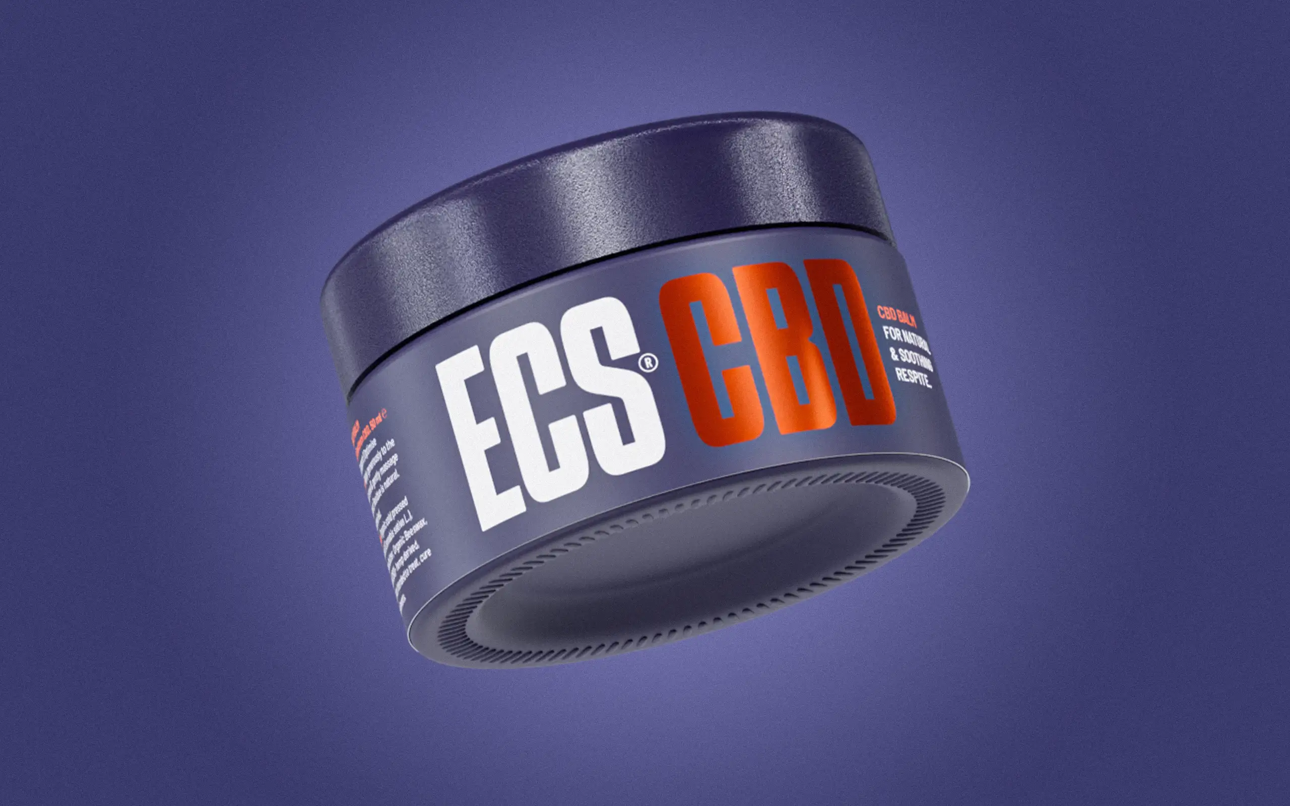
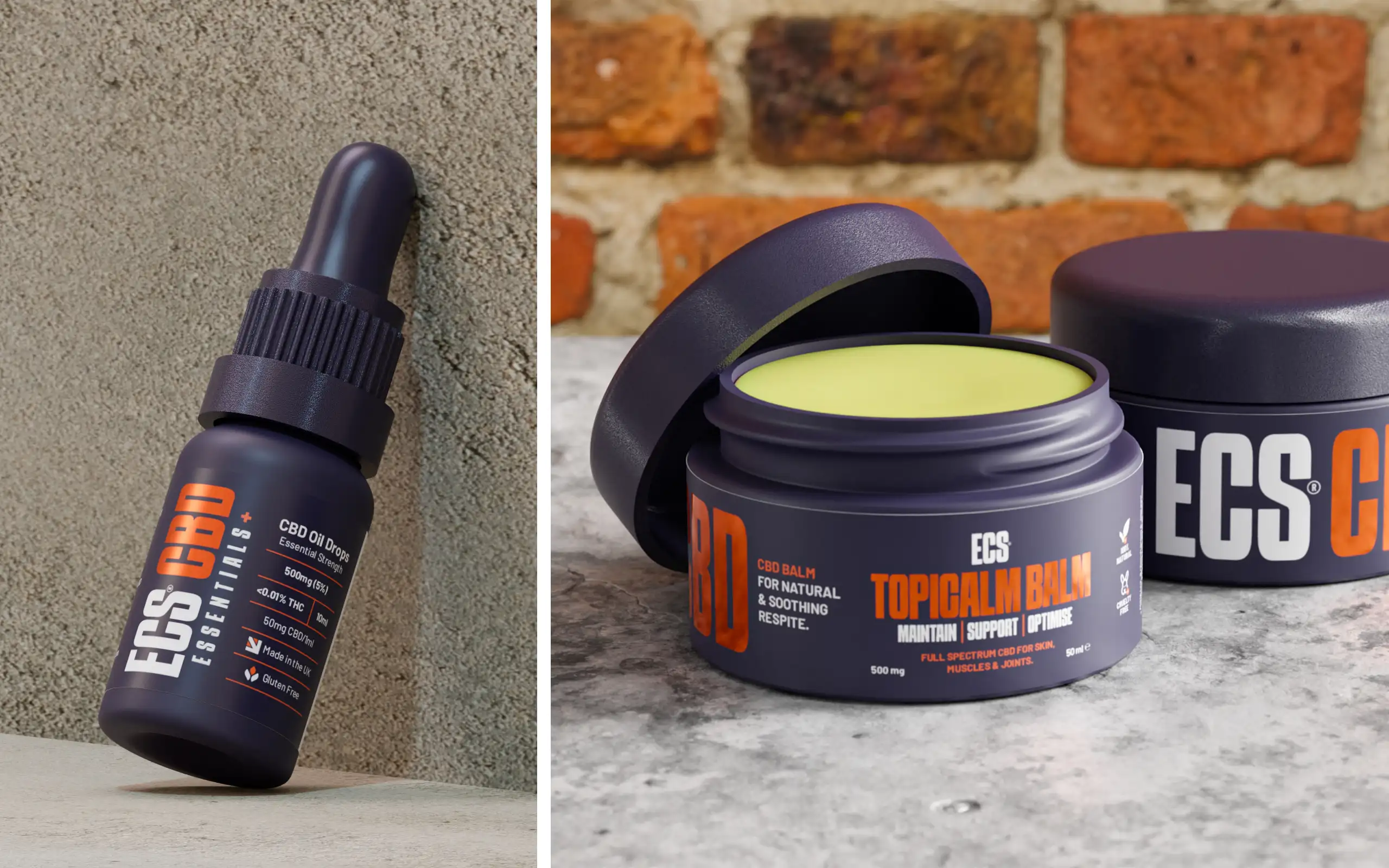
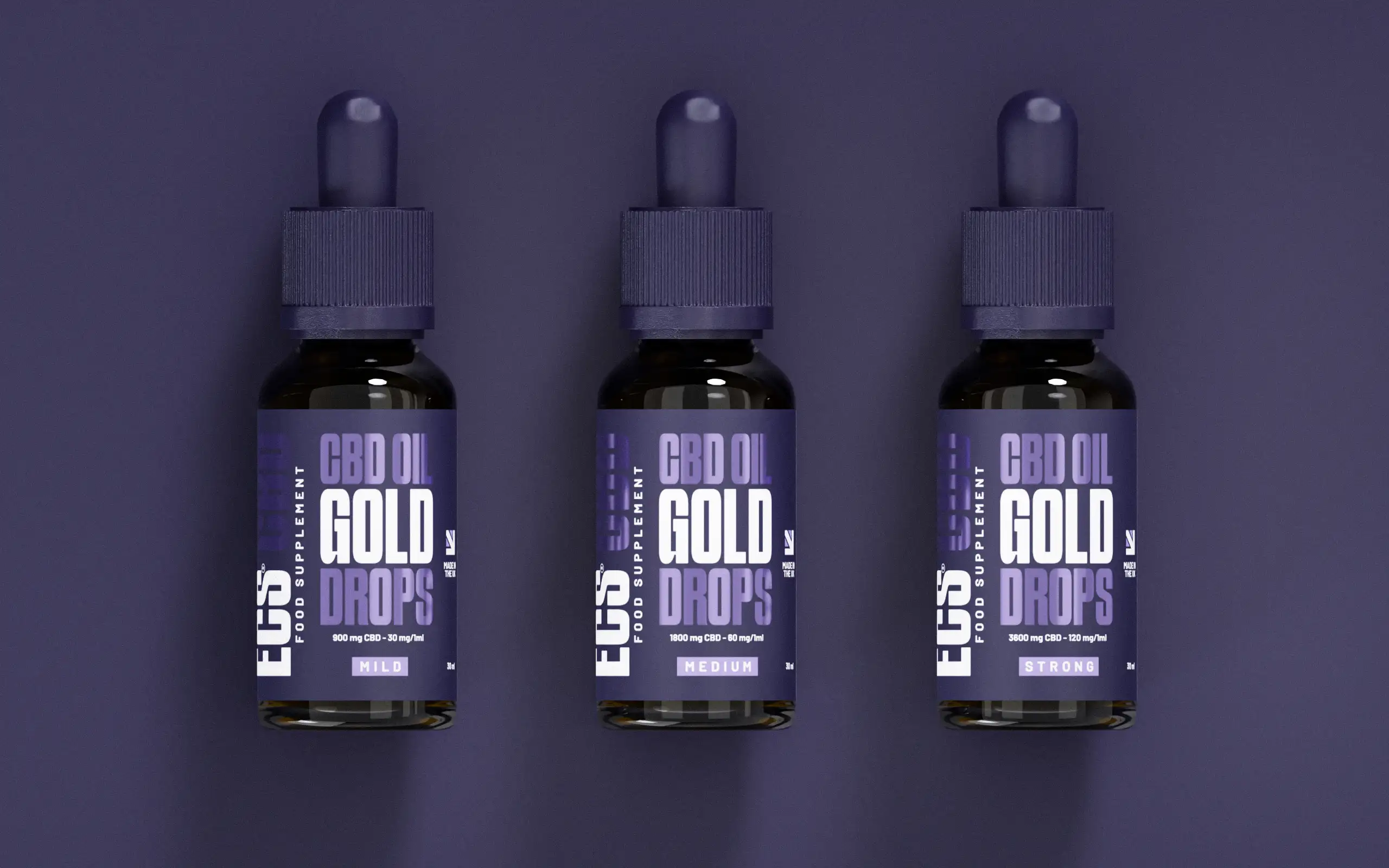
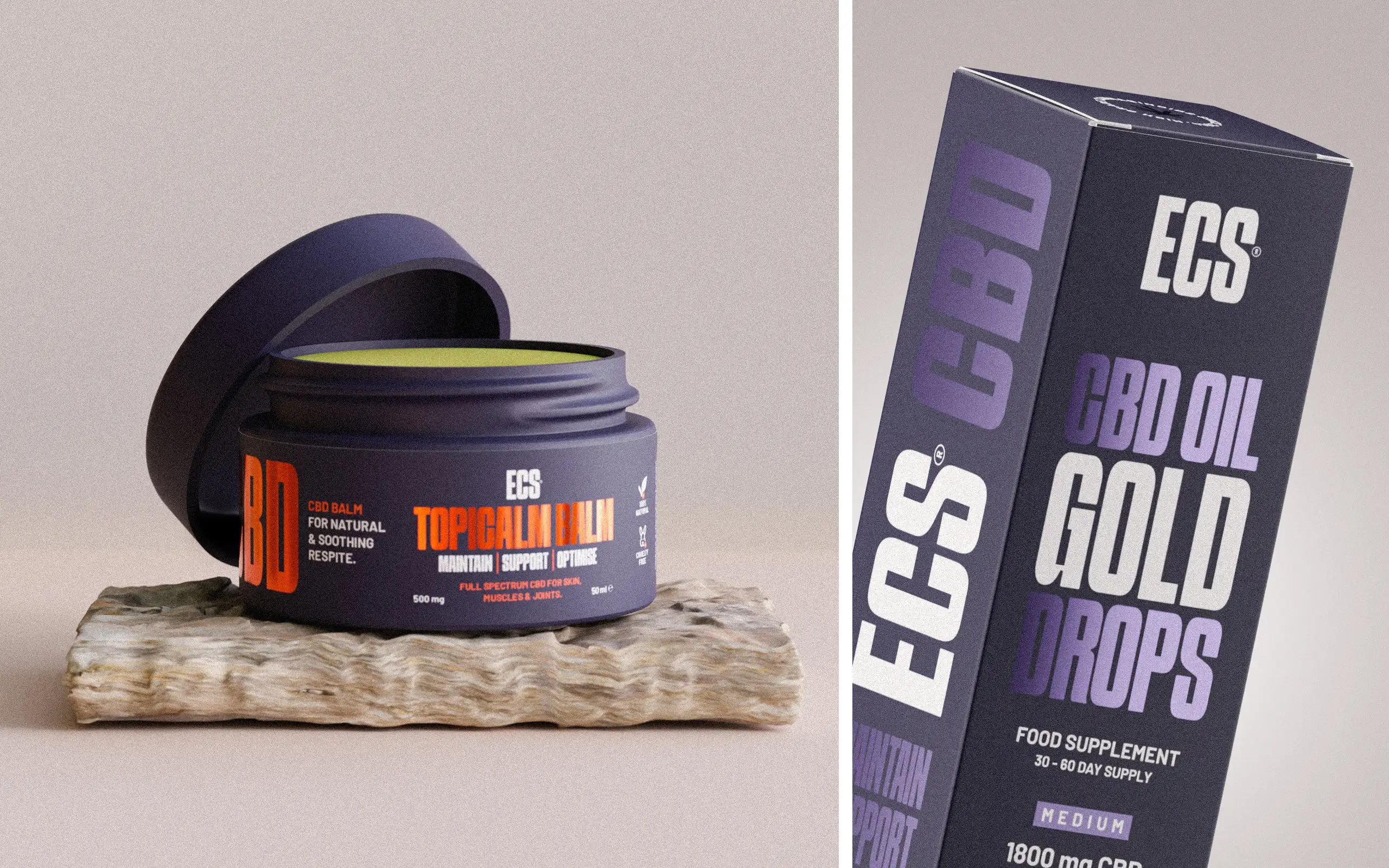
Following initial research and a comprehensive branding presentation, we established a strong visual direction built around a deep navy blue base paired with vibrant foil accents. This contrast became a defining feature of the brand, helping it achieve a premium and eye-catching look.
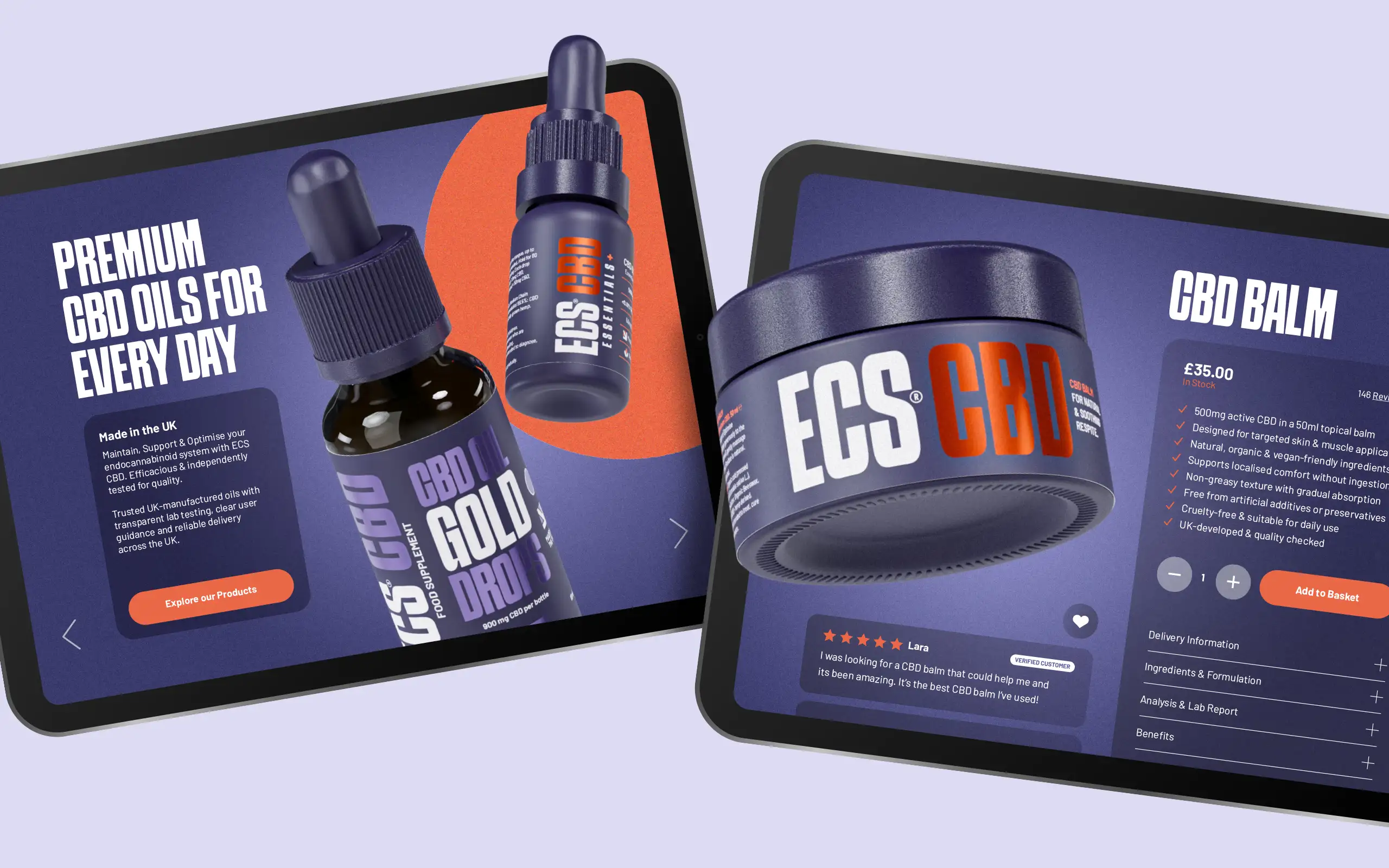
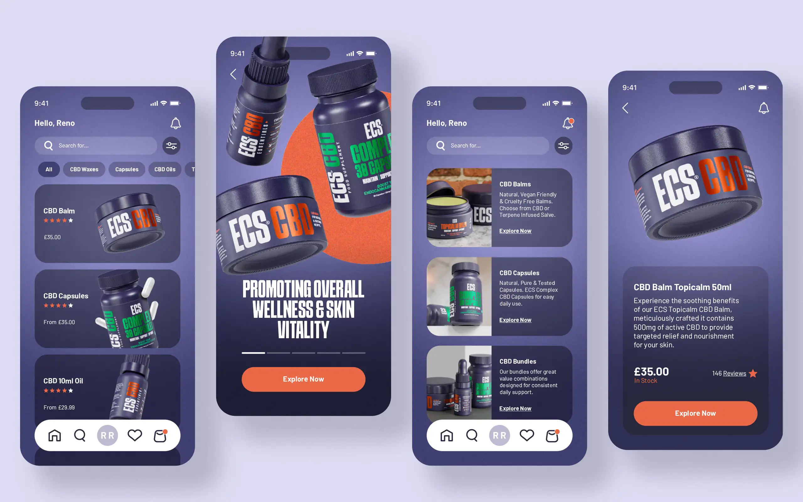
Once the packaging designs were finalised, the project extended into the digital space. This included creating mock-ups for the website, as well as visual assets for digital platforms and marketing materials, ensuring a consistent brand experience across all touchpoints.
Typography & Colour System
The brand uses bold, impactful typography for headings, combined with the Barlow font for body text—chosen for its clean, modern, and slightly technical feel.
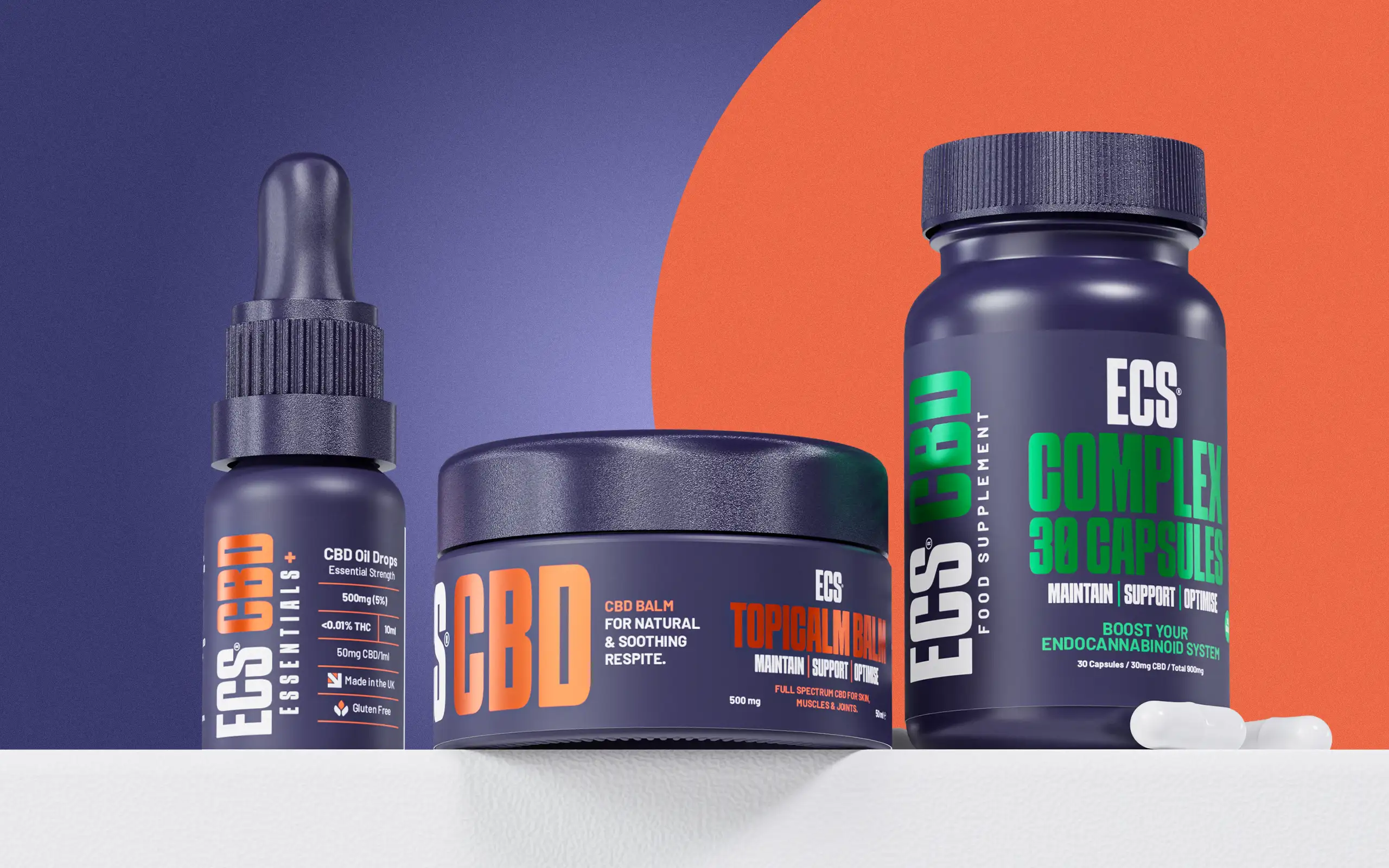
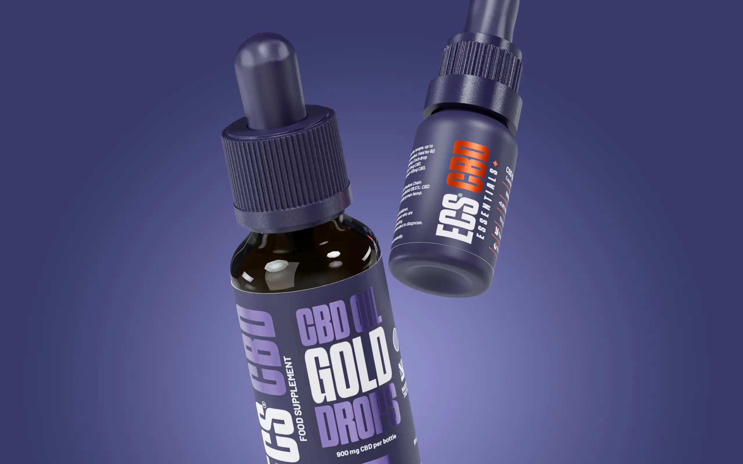
The core colour palette centres around navy blue as a background, complemented by a striking electric orange used to highlight key elements. This system allows for flexibility across product lines, introducing additional colours such as green, blue, and pink to differentiate variations—while maintaining orange as the primary accent for consistency.
The Final Outcome
The final result is a bold and cohesive brand identity that stands apart from the competition. The combination of navy blue with vibrant foil accents creates a modern, sporty, and energetic look—avoiding the conventional earthy aesthetic often associated with CBD products.
This approach not only enhances shelf presence but also ensures consistency across the full product range, resulting in a professional, contemporary, and transparent brand image.