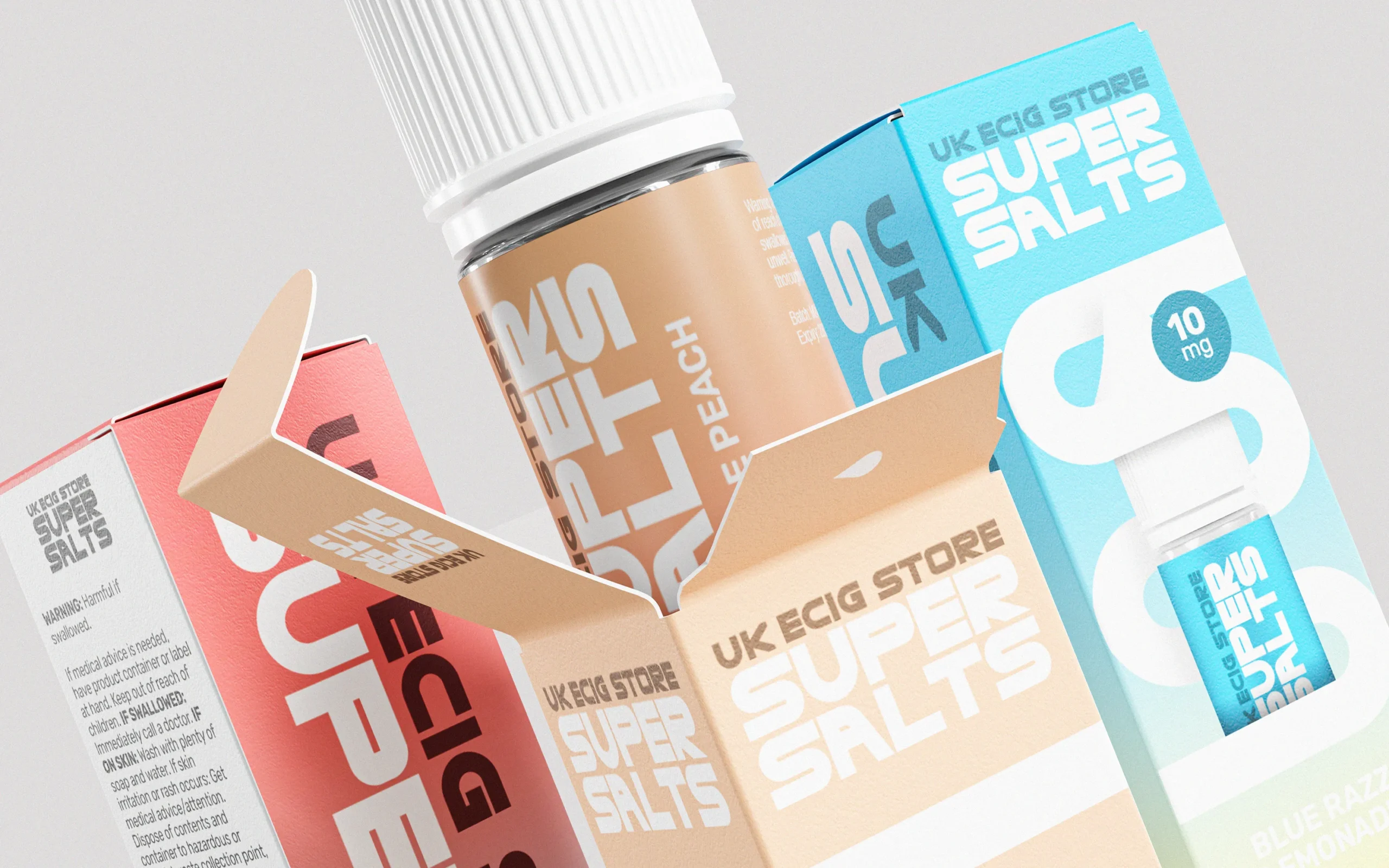
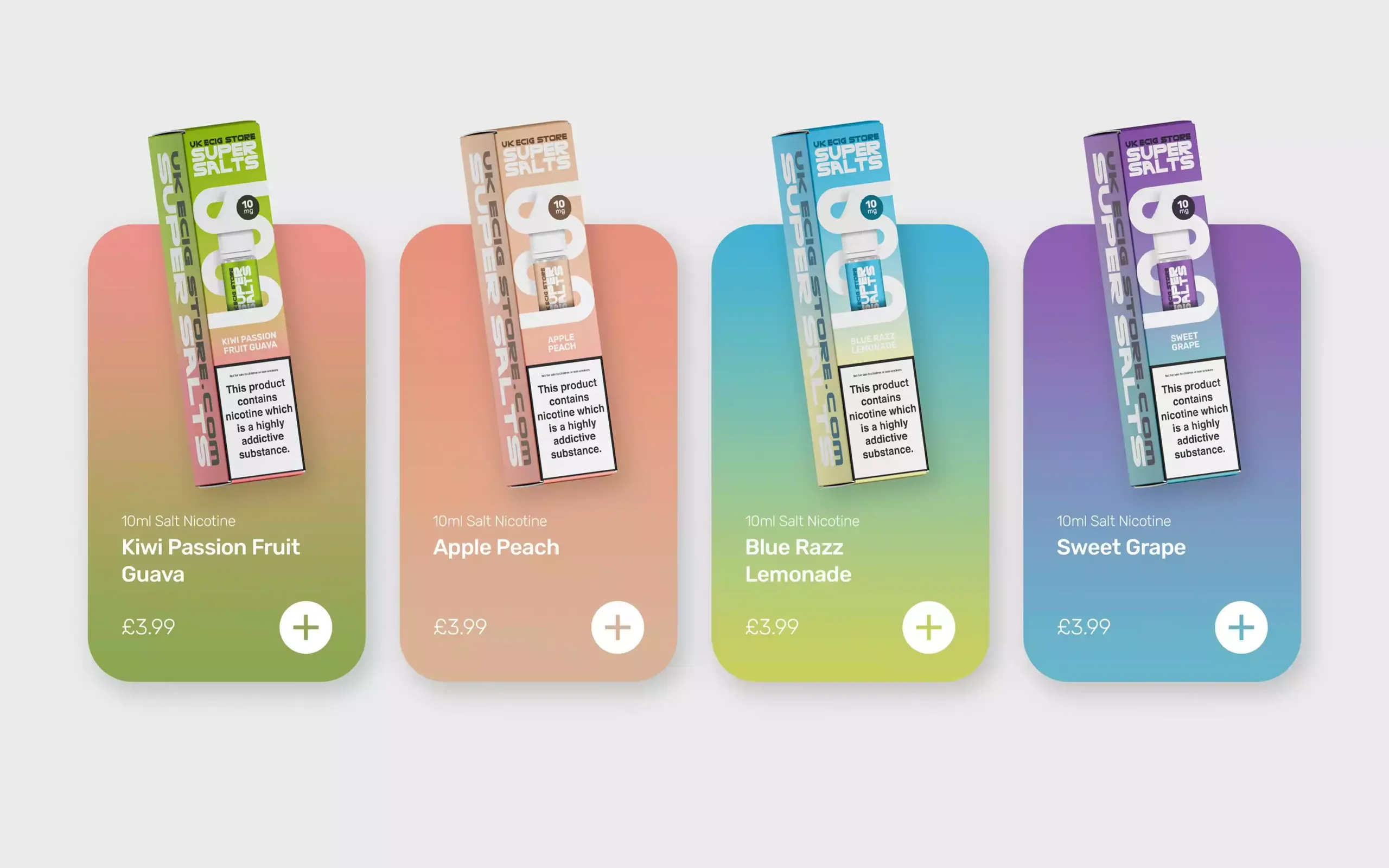
Packaging and brand identity for a new range of Nicotine Salt E-Liquids from UK ECIG STORE
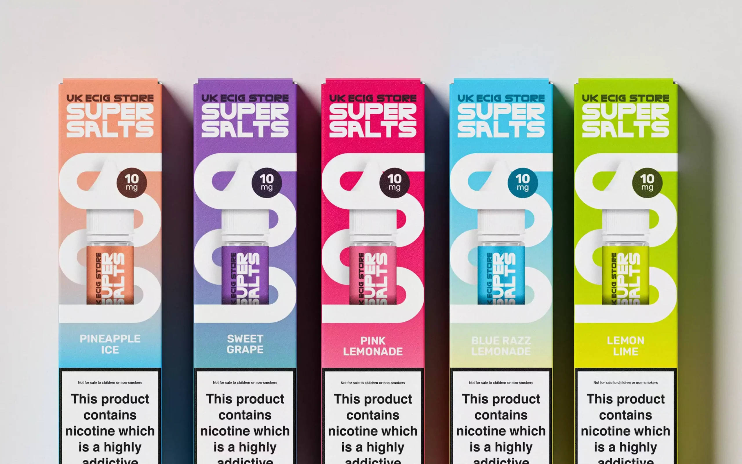
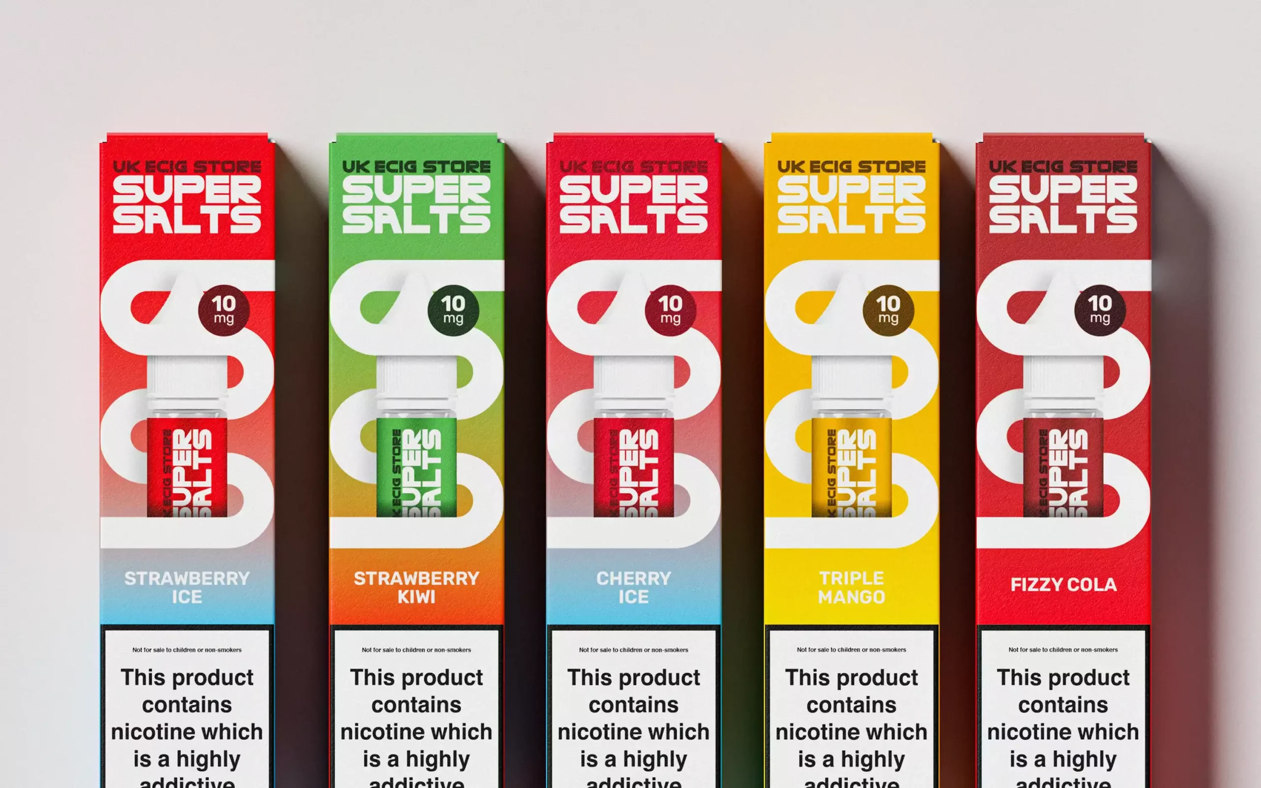
UK ECIG STORE has been a major player in the UK vaping scene since opening the country's first vape shop in 2010. The brief was to launch a new range of 20 flavours, each with its own distinct look, while still reading as one cohesive collection.
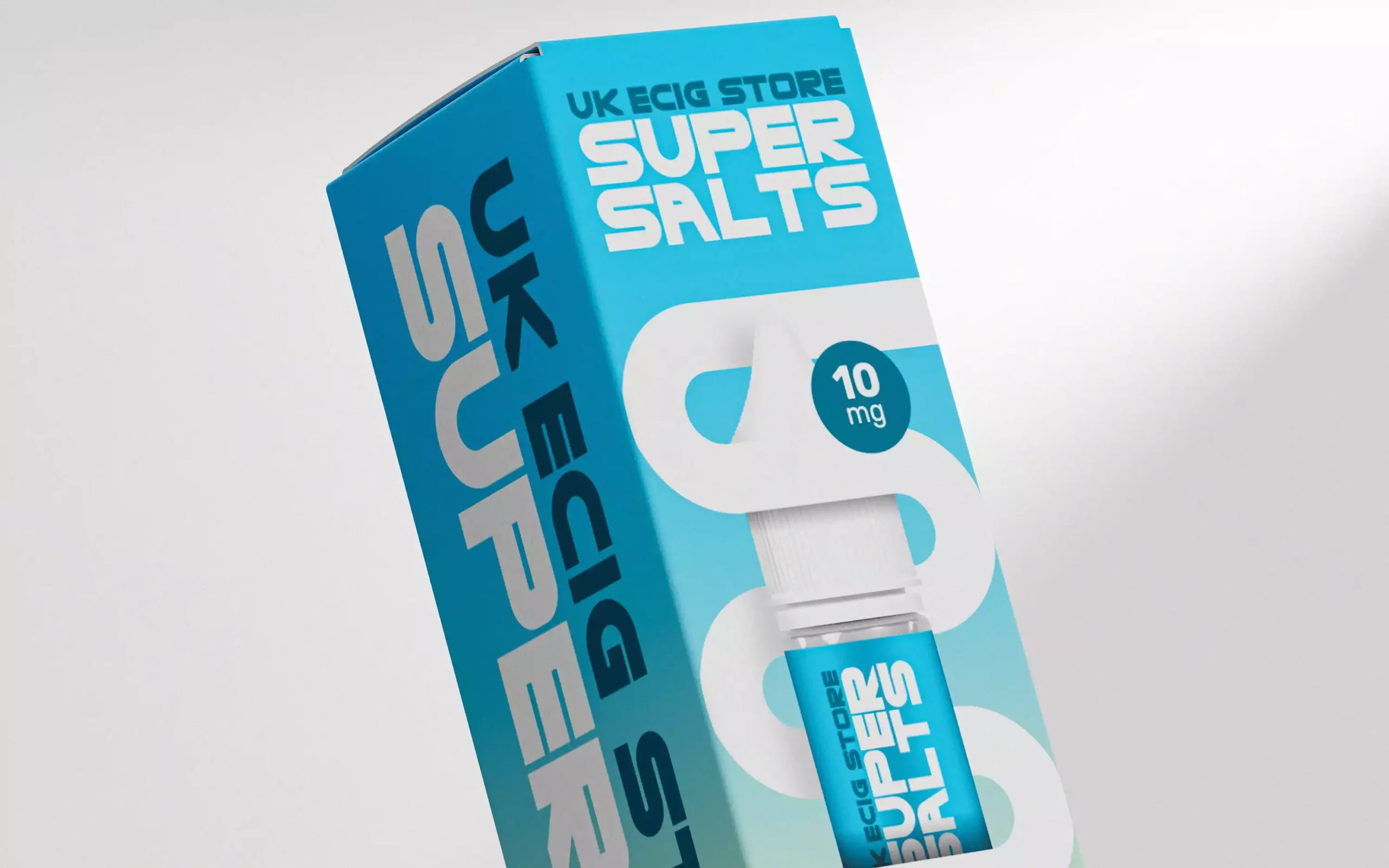
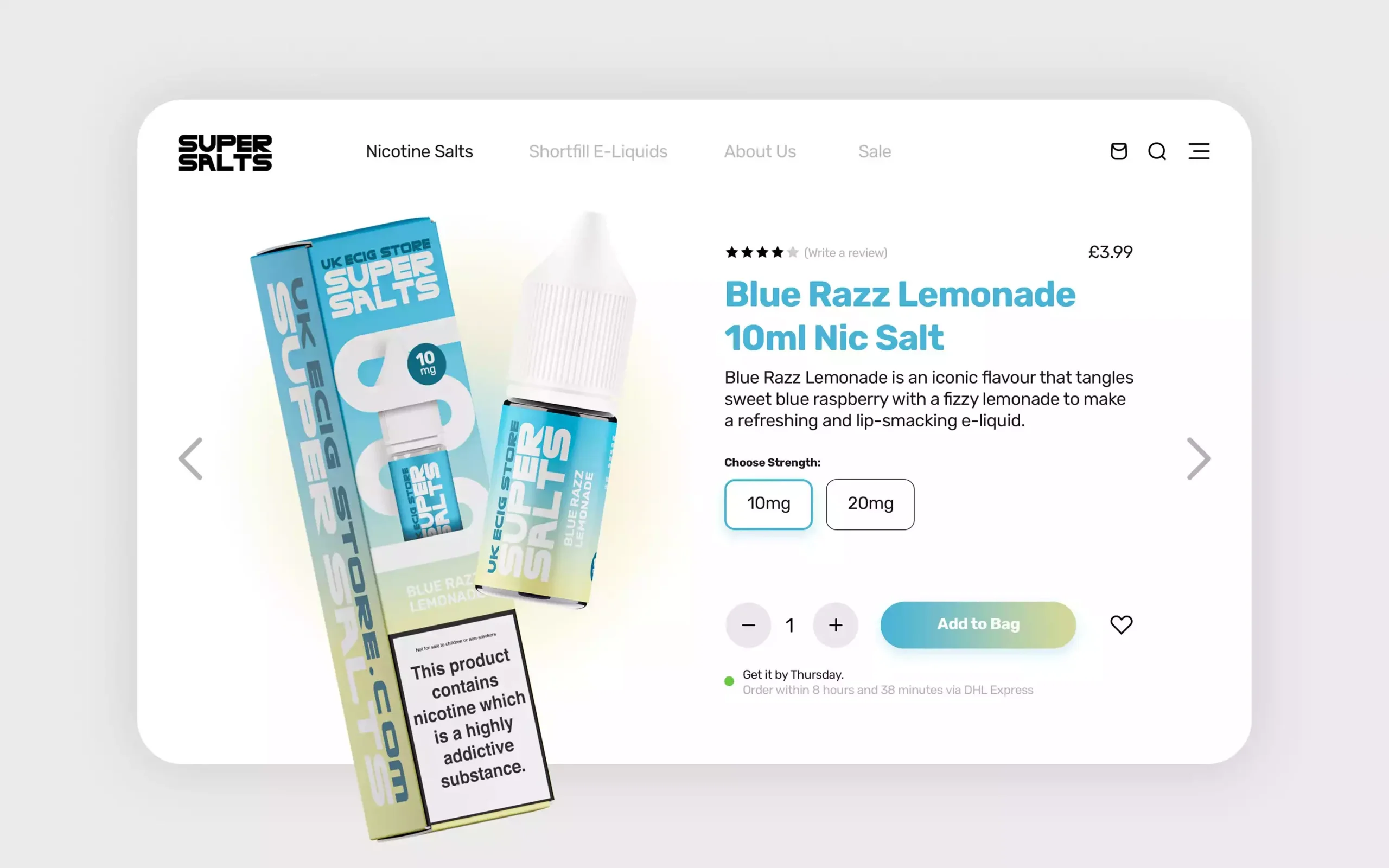
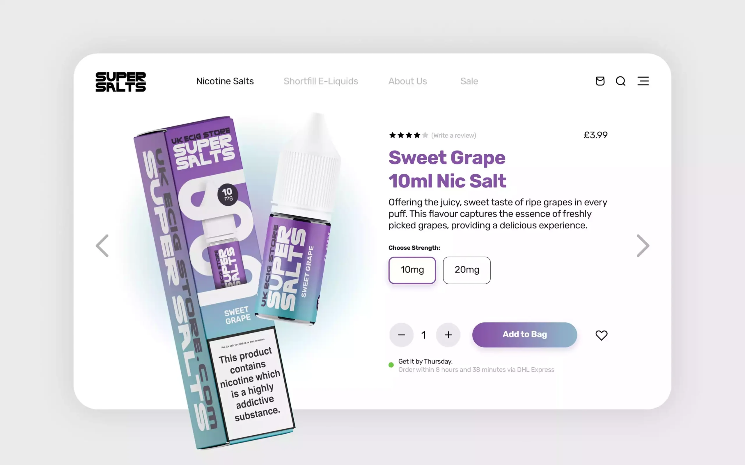
We landed on tall, premium packaging built around a new Super Salt logo and a bold, flavour-led colour system, designed to stand out on the shelf and carry through to the brand's own website.
Client: Super Salts / UK ECIG STORE
Location: United Kingdom
Industry: Vaping & Retail
Service:
• Branding
• Packaging
• Digital Assets
Deliverables:
• Branding
• Identity Design
• Packaging
• Website Assets
The Design Process
Design goals and brand identity.
01
The challenge
The brief was clear: create a new range of 20 flavours, each with its own distinct look, but still feeling cohesive as part of a larger collection, a design that would make a statement in a competitive market and appeal to loyal customers and new vapers alike.
02
Packaging
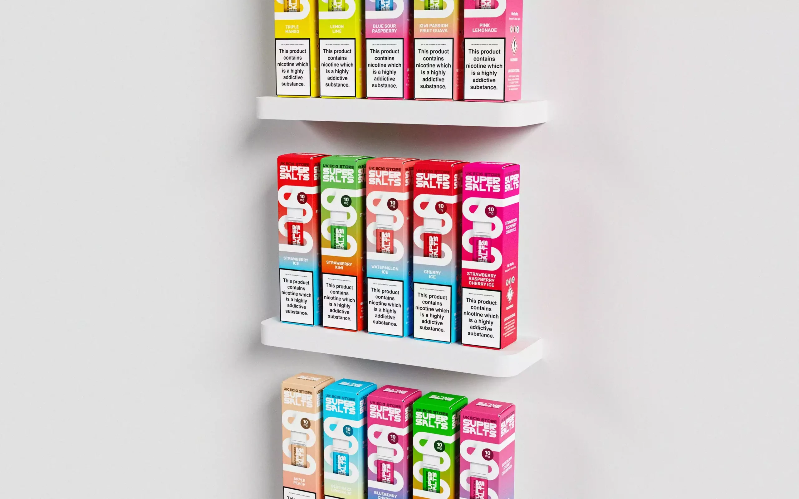
When it came to packaging, we wanted something that would grab attention. After exploring a few options, we landed on tall boxes, more space to get creative, and a premium, high-quality feel that let each flavour shine and stand out on the shelf.
03
Colour and branding
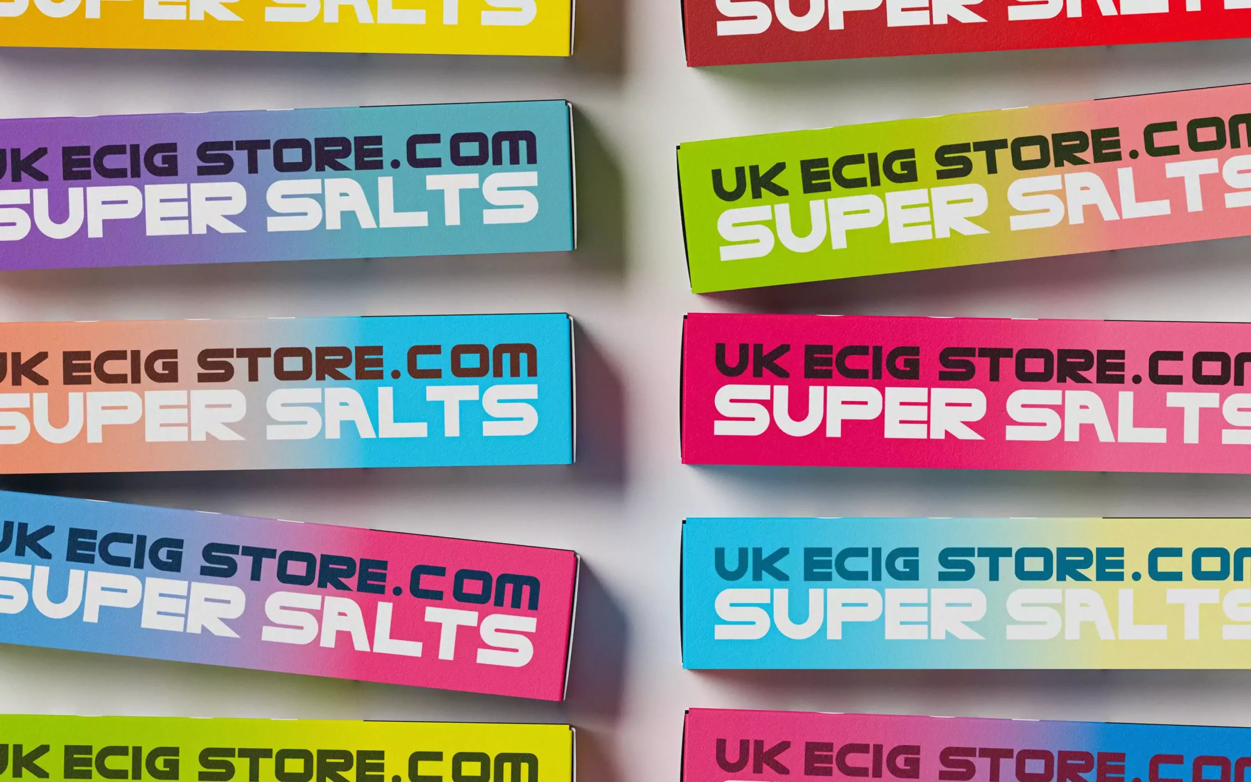
With 20 flavours to differentiate, colour was crucial: bold, vibrant tones matched to each flavour's personality, bright and fresh for the fruity flavours, deeper and more indulgent for the dessert ones. The packaging centres on a new Super Salt logo, with bottles wrapped in a distinctive double-SS design.
04
Typography
Typography carries over the new font being rolled out across UK ECIG STORE's upcoming website, creating a seamless experience between the packaging and the brand's digital presence.
The goal was packaging that conveyed the vibrancy and excitement of the flavours inside. Light, clean backgrounds with dynamic lighting make the colours pop, so the range feels as lively and energetic as the flavours themselves.
The Result
The finished range does two things at once: each of the 20 flavours has its own identity, but they all clearly belong together as one collection. The packaging is deliberately modern and uncluttered, so the flavour and the key details land in about a second, which is all a shopper gives you on the shelf. A polished, consistent range like this is also easier to put in front of retail buyers, and it gives someone already buying a competitor a reason to try this one instead.
Why work with me?
You work directly with me throughout the project, meaning the person developing your design is also the person you'll be speaking to. No layers of account management and no unnecessary agency process.
You get:
17+ years of professional design experience
Direct communication from start to finish
Experience with food, beverage, health and wellness brands
Packaging that has reached major UK retailers
Flexible solutions for start-ups and established businesses
A straightforward, collaborative approach
I bring the creative thinking and attention to detail of a design studio, without the large agency structure or unnecessary overheads.
Got a brand that needs this kind of attention?
Tell me about your project and I'll tell you honestly if I'm the right fit.